Many Hong Kong citizens are currently protesting for democratic reform in downtown Hong Kong. As is expected, the Chinese netizens have taken to social media to spread their message. Instagram in particular was in the press as there were reports…
Which Cancer Centers are Closest to You?
Last week I described how Voronoi diagrams can be created in R. Using that technique (and some heavy post-processing in Photoshop), I created this Voronoi diagram of the NCI-designated Cancer Centers in the U.S. According to the website, these centers…
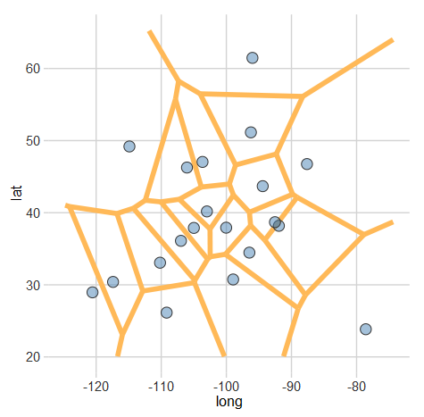
Creating Voronoi Diagrams with ggplot

A Voronoi diagram (or tessellation) is neat way of visualizing spatial data. It essentially allows us to see the areas that are closest to a set of locations. For example, this map shows all of the Criagslist localities and the…
Restaurants Closer to Columbus’ Population Center are Better
Following my last post on Ohio’s population center, I wanted to get a bit more local. My home town of Columbus has a unique population characteristic: the population is almost uniformly dense. Despite this, I know from personal experience that…
Population Center of Ohio
There are a few different ways of determining a population’s center, but the method I used for this graph is the one currently used by the Census [PDF]. If every person were the same weight, where would the balancing point…
