Review: Naked Statistics

My list of books to read grows much more quickly than I actually end up reading the books on the list, but I tend to prioritize books that are recommended to me. In the case of Naked Statistics by Charles Wheelan, I read about it on Stephen Few’s blog which is as good as any recommendation.

Statistics and data analysis are inevitably linked, but the truth is that you can do a lot of good analysis with just a few basic statistical ideas and methods. This book does a great job of touching on most of those ideas and methods. Each chapter focuses on a separate concept and is illustrated with examples (both contrived and real-life).

If you are scared of math, fear not. You can’t have statistics without math, but Wheelan does a great job of easing the reader into it and thoroughly explaining all the notation he uses. In some cases, the math is even moved in a chapter appendix so it is the reader’s choice to skip or read it.

My only criticism of this book is that it might be a bit too short. I was hoping to read a little bit more about probability and Bayesian methods, but to be fair, statistics and probability aren’t exactly the same thing.

The best thing about this books is it really hammers home how important statistics are in the modern world. You don’t need to be an expert, but anyone who is interested in the way the world works should have a basic understanding of statistics. I recommend it to anyone who is looking for an entertaining introduction to to the huge world of statistics and how they affect everything from the economy to healthcare to education.

IMDB Television Series Data

IMDB is a website that aggregates various pieces of data about movies and television series. Users can submit their own data, including reviews and ratings. IMDB has several datasets available for download, one of which is the rating data for every entry in their database.

I chose to look just at TV series and even within that set of data, there is a lot of interesting information. One note on the data: users can rate an entire show on the show’s main page and/or rate individual episodes. This data only looks at the individual episode ratings.

Best and Worst TV Shows

The top rated and lowest rated series was easy to find, but I wanted to exclude odd, esoteric series that few people have seen. These tables show series that have an average of at least 250 votes per episode.

Best TV Shows:

SeriesAvg. Score
South of Sunset (1993)9.400
Planet Earth (2006)9.155
Band of Brothers (2001)9.090
Anything But Love (1989)8.900
Fawlty Towers (1975)8.867
Game of Thrones (2011)8.810
Breaking Bad (2008)8.807
Firefly (2002)8.764
The Wire (2002)8.763
Freaks and Geeks (1999)8.761

Worst TV Shows:

SeriesAvg. Score
Ben Hur (2010)5.700
Beck (1997)5.923
Wallander (2005)5.967
Fear Itself (2008)5.969
Masters of Horror (2005)6.1423
Veronica Mars (2004)6.344
Rags to Riches (1987)6.400
Knight Rider (2008)6.656
Stand by Your Man (1992)6.800
The Shield (2002)7.000

My wife says this can’t be accurate because “Veronica Mars is a great show,” but I guess the internet disagrees.

Another way of controlling what gets placed into the top and bottom is to look at overall votes. By looking at series with a total of at least 1000 votes, we get to see shows that (generally) span a longer time since more episodes equals more votes.

Best TV Shows:

SeriesAvg. Rating
Planet Earth (2006)9.155
Band of Brothers (2001)9.090
Fawlty Towers (1975)8.867
Absolutely Fabulous (1992)8.858
Saving Grace (2007)8.817
Game of Thrones (2011)8.810
Breaking Bad (2008)8.807
Oz (1997)8.771
Firefly (2002)8.764
The Wire (2002)8.763

Worst TV Shows:

SeriesAvg. Score
House of Payne (2006)1.260
Renegade (1992)2.399
The Simple Life (2003)2.695
MADtv (1995)3.807
Witchblade (2001)4.113
Rosamunde Pilcher (1993)4.362
The Tonight Show with Jay Leno (1992)4.385
American Idol (2002)4.453
Dancing with the Stars (2005)4.530
Baywatch (1989)4.782

Even with this adjustment, many of the top shows are the same. However, the bottom shows are a bit more interesting in this table. We see shows with many seasons and no story arcs (e.g. talk shows), but also the controversial sitcom House of Payne.

Consistency

Sticking with shows that have a total of at least 1000 votes, I wanted to see which shows are most and least consistent. To find this, I subtracted the minimum episode rating from the maximum episode rating.

Most Consistent Series:

SeriesDifferenceAvg. Rank
Planet Earth0.19.15
Black Mirror0.27.93
Murder Rooms: Mysteries of the Real Sherlock Holmes0.37.88
Police Squad!0.38.20
Taken0.57.62
The Hollow Crown0.58.13
Band of Brothers0.59.09
Day Break0.57.77
Forbrydelsen0.67.73
Generation Kill0.68.41

Least Consistent Series:

SeriesDifferenceAvg. Rating
Jimmy Kimmel Live!8.84.85
The Tonight Show with Jay Leno8.84.38
ABC Afterschool Specials8.65.82
SpongeBob SquarePants8.07.28
Disneyland7.97.18
Horizon7.77.53
Big Time Rush7.74.98
Hawaii Five-O (1968)7.76.89
Video on Trial7.66.62
Screen Two7.66.78

Note that consistency doesn’t necessarily correlate with overall rating (even with all shows plotted out). Taken and Sponge Bob have similar overall ratings, but they are very different in terms of consistency.

“I can’t believe they cancelled ____” and “That show is still on?”

I pulled the best shows with only one season and the worst shows with at least five seasons. To be fair, some of the one-season shows are intended to be mini-series. However, you’ll also notice many cult classics.

Top Rated Series with One Season:

SeriesAvg. Score
Planet Earth9.155
Band of Brothers9.090
Firefly8.764
Freaks and Geeks8.761
Spartacus: Gods of the Arena8.667
Mr. Bean8.579
Wonderfalls8.450
My So-Called Life8.432
Shin seiki evangerion8.423
Generation Kill8.414

The worst shows that have at least five seasons are particularly interesting because it shows a disconnect between the people who rate TV shows on IMDB and the public at large. These shows are or were profitable otherwise the television companies would cancel them.

Worst Rated Series with At Least Five Seasons:

SeriesAvg. Score
House of Payne1.26
MADtv3.81
The Tonight Show with Jay Leno4.38
American Idol: The Search for a Superstar4.45
Dancing with the Stars4.53
Baywatch4.78
Jimmy Kimmel Live!4.85
Walker, Texas Ranger4.91
7th Heaven5.32
Big Brother5.33

Rating Distribution

In looking at this data, I noticed that it’s pretty hard for a show to get a low rating. The large majority of shows are in the 7-9 range, and very few shows have an average below 5.0. The median rating was 7.4 which may be a side-effect of a 1-10 rating system. Notice also the two up-ticks at 1.0 and 10.0. (Click to enlarge)
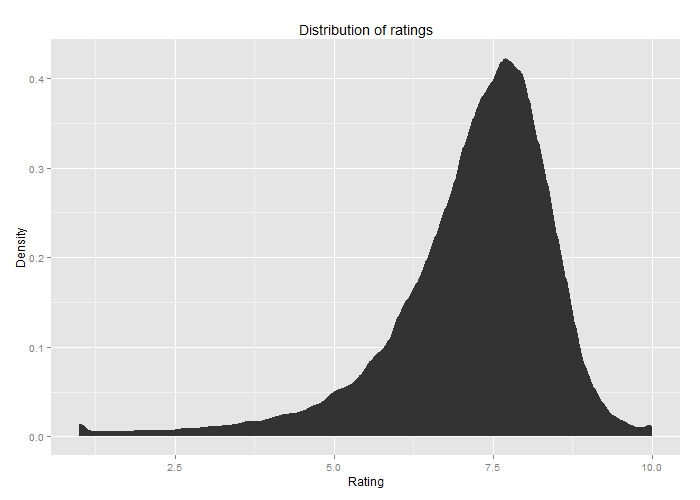
IMDB TV Rating Distriubtion

A distribution graph of the ratings of TV shows on IMDB.

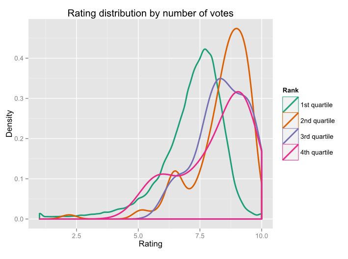
I was curious to see if the number of votes changes the distribution. This chart shows the four quartiles of the number of votes per episode. (Click to enlarge)
IMDB TV Rating Distribution Quartiles

Distribution of IMDB ratings, broken down by quartile.

The first quartile is almost identical. The fourth quartile is interesting because it has two distinct modes. If a popular show has a bad episode, it likely draws in more people to vote giving us the peak around 6.0.

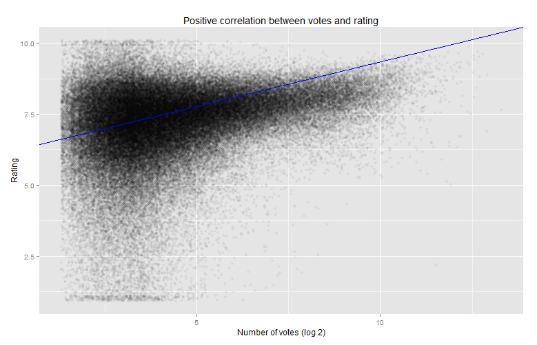
Since the episodes in the fourth quartile are also often the highest-rated, I wondered if there was a correlation between number of votes and rating. Logically, it makes sense that the better a show is, the more popular it is, and therefore more people will be voting on it.

This chart has jitter applied because I found the distinct bars to be distracting. (Click to enlarge)
IMDB votes vs. avg. rating

Comparison between the number of votes and avg. score.

The correlation is there, but it is loose (R=0.092).

<h4>Shows over time</h4>

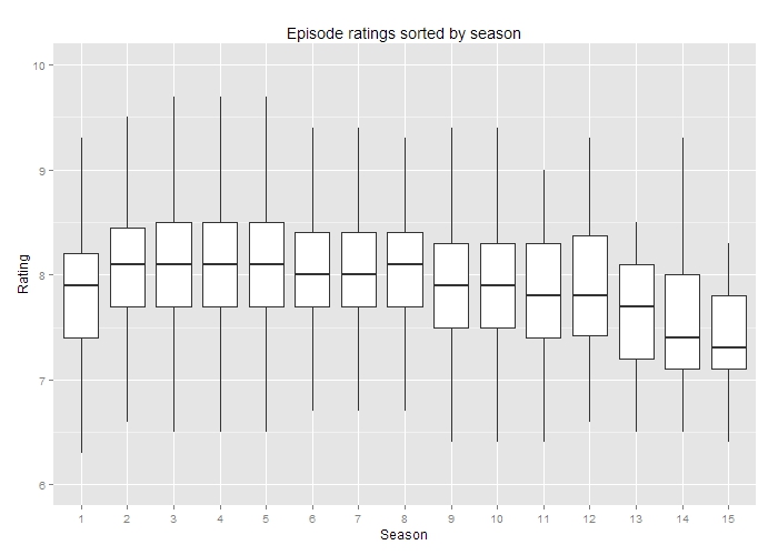
My opinion is that a good show should only rarely go past five seasons. Most of my favorite shows are ones that knew when to stop. This chart shows the distribution of episodes according to season (outliers excluded). (Click to enlarge)
Average rating by season

The average TV series rating by season

My five-season marker seems to hold true in this chart. There’s a noticeable dip for sixth and seventh seasons. And after eight seasons, it’s mostly downhill.

<h4>Golden age of TV</h4>

Many critics agree that television in the past few years is the best it has ever been. We’re getting movie-quality writing, acting, and directing over dozens of episodes. To test this, I plotted the median rating per year since 1980. (Note, the data set shows the year in which the series started, not the year of the episode itself.)
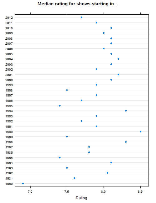
Median rating by year

The median TV series rated for each year.

While not definitive, you can definitely see that starting in 2003, TV has been moderately consistent. This is change from the 80s and 90s when it was more hit or miss.

The economy’s affect on dog ownership

After recently listening to a podcast about dog shows, I wondered if dog show outcomes have any influence over dog ownership. Now keep in mind, I don’t like dogs. They’re loud, messy, and dependent. But I do like data. Good data is quiet, clean, and and can stand on its own. In summary: dogs bad, data good. I can do dog-data.

I started by grabbing the dog registration counts from the Kennel Club. (It took some fairly obnoxious cleaning up, so I have a clean set of the data available here.) I then compared that to the list of Crufts winners and found…no correlation. Some of the less well-known breeds got a boost, but nothing overall.

So what does influence dog ownership? Probably many factors, but the state of the economy seems to be a good indicator.

Since all this data is from the U.K., I next found the % change in the London FTSE for each year. As it turns out, the percent change each year is a pretty strong indicator of how much dog registrations will change the next year, as this graph shows.

Economy's influence on dog registrations

Economy’s influence on dog registrations

There may be some other neat data in here, breaking it down further by class of dog or breed. If you find something, share it in the comments.

Predicting real names while blocking fake names

I was on a forum recently where I noticed several of the posts were moderators informing new users that they were violating the site’s rules by not using a real name. The rules require users to use a real name or at least something “name-like” in order to participate in the community. I started wondering if it would be possible to design a system that could predict name validity.

A simple solution would be to run the name through a database of known names, but new names are constantly being creating, making this method fairly short-sighted. Better would be to train a system with sample names and then give a provided name a score that assesses its validity.

To accomplish this, I needed three sets of data:

  1. A list of real names to train the system
  2. A list of real names to test the system
  3. A list of fake names to test the system

Sets one and two were easy to come by. The SSA maintains a database of all birth names that can be downloaded and easily parsed. I found the top 1000 names to be not quite a good enough training set. 10000 was unnecessarily long and 5000 seemed to be about right. Set two is just a random sampling of names based on the frequency provided in the dataset. For my third set, I searched pastebin and found a list of about 750 Youtube usernames (I removed non word characters from this list).

There are probably dozens of approaches one could take to train the system, but I decided to use letter clustering. I wanted to see which three-letter clusters were most common in names. For example, the name “Timothy” beaks down into TIM, IMO, MOT, OTH, and THY. I ran through the list of training names and counted the frequencies of each possible combination. As it turned out, further training by including word breaks helped a lot. So I did another pass of the data and included “*” as a name-break character. There are 51342 possible clusters when including the name breaks, but interesting only 2.67% of the clusters show up at all in the top 5000 names. The top clusters were RIS, ANN, *MAR, ARI, and AND.

Next came the interesting part. I passed each set of test data through the same system to generate the clusters in the names of the test data. I summed the frequency counts of each cluster and divided by the number of characters in the name to normalize the score.

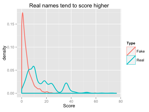
Here’s a comparison of the score densities of the two sets:

Probability of real vs fake names

I was pretty happy with these results. With no refinements other than accounting for name breaks, the median real name score was 7.33 points higher than the median fake name score. Assigning a “tolerance level” would be up to the site owner. Setting the tolerance too high would result in annoying a lot of people using a real name with a low score, while setting the tolerance too low would allow too many fake users. Using a tolerance of 6.0, this method would flag ~22% of real-name users and allow ~22% of fake name users to pass by without a flag.

So what improvements could be made?

  1. Short real names still get too low of scores even when normalizing the scores. For example, the names “ADAM” and “JUAN” both only get a  score of 1.0.
  2. Some fake names are still “name-like” and therefore will pass by easily. Consider “CHARLIEIZE” and “CODEYBRISTOL” with scores of 28.7 and 17.75 respectively.
  3. It will undoubtedly fail miserably for real names in languages other than English.

However, I think this proves the proof of concept and would be fairly simple to implement as a second step in the name verification process. There were only approximately 22,000 unique names in my SSA dataset. Comparing the new user’s chosen name through a database of that size is fairly trivial. If a match is found, the name would be validated. If not,  a probability method such as this could be implemented to detect the validity of the name.

Hyper Local: Property data about Merion Village

My wife and I bought our first house this year and one of the most important things to us was location. We like being close to good dining and retail, and I bike to work downtown. There are a few nice neighborhoods close to downtown and one that is definitely seeing a huge revitalization is Merion Village.

The neighborhood center is approximately two miles south of downtown Columbus, Ohio and is generally bordered by German Village on the north, the Scioto River on the West, Parsons Avenue on the east, and Hungarian Village on the south.

Property Types in Merion Village

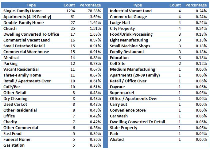
The neighborhood is primarily residential, although there are some pockets of commercial properties. The two main streets on the east and west are also heavily commercial. This table gives the specific breakdown of the property types.

Merion Village property types table

Property types table (click to enlarge)

(If you want this data in simple text format, click here (CSV).)

Using the geocoded data from the dataset, I was able to plot the points on an XY grid that corresponds to a map. I simplified the categories and removed all but the main roads for this map.

Map of property types

Property types in Merion Village (click to enlarge)

Age of properties in Merion Village

Merion Village is a relatively old neighborhood for the city, with many properties dating to the early 20th century.

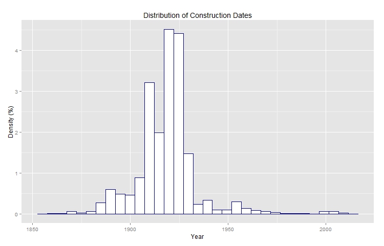
This is a distribution of the construction dates:

A histogram of the property ages

Property ages in Merion Village (click to enlarge)

The construction dates on many homes are not known and, unfortunately, this isn’t always coded properly in the data. Some values are blank and some are marked as “OLD”. Additionally, there is a record-keeping quirk where at some point the year 1910 was generically used for any unknown date prior to 1920. This explains the spike at 1910.

This map shows the construction dates of properties. Of interest is the northwest corner with a lot of pre-1900 homes.

Map of properties colored by construction date

Construction date map (click to enlarge)

Merion Village Property Values

Because of the various property types, all of my analysis on property value was done just on single family homes. The value I used is the land value plus the structure value.

The median property value was $122,300. The neighborhood tends to be a little bit hit-or-miss. Some properties are essentially dilapidated, but others are extremely well-maintained. Some properties are worth less than $10K, while others are in the $400K range.

Here is the distribution of the property values:

Property values in Merion Village

Property value histogram (click to enlarge)

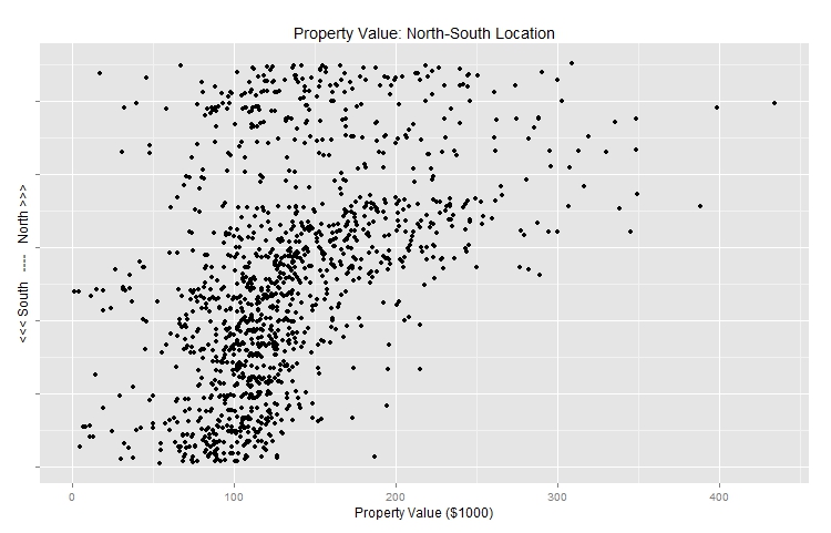
Intuitively, I knew that the houses closer to the north (German Village) would be more valuable. I also assumed that the properties more east or west would be less valuable as they are closer to the commercial areas of the neighborhood.

To get a better feel for this, I plotted the property values compared both their North-South and East-West location. The North-South correlation is loose, but obvious, whereas the East-West correlation is much less pronounced. You can see a slight dip on the east and west extremes, but not much variation in the middle.

Merion Villages property value North-South

Property values north-south (click to enlarge)

Merion Villages property value East-West

Property values east-west (click to enlarge)

Finally, I plotted these values on the map in a similar fashion to the map above.

Single family home values in Merion Village

Value of single family homes (click to enlarge)

Data

Some notes on the data:

The data comes exclusively from the Franklin County Auditor’s website, but they have two different tools to download data. For some reason, the Web Reporter does not include the neighborhood or “Auditor Map” data that was critical in filtering out properties. On the other hand, the Download Manager does not include the x-y positional data included in the Web Reporter! I manually combined these data sets in SQL and then removed the duplicate columns.

A (mostly) complete explanation of the fields is available here (PDF) through the auditor.

I added the following columns:

  • luse_cat: A text field describing the general land use
  • yearblt_int: A numeric field representing the year the property was built
  • tranyear: A numeric field representing the year of the most recent transaction (trandt)

The rows were culled mostly manually so there may be a few stray properties that were removed erroneously or some that are incorrectly in the data set. Additionally, I intentionally did not include a large swath of land in the southwest of the neighborhood. This land is mostly empty and industrial use and I felt it was not relevant to this presentation.

The data used was the most recent data set available, which is from October 2012.

References