Will I Get Rained On?

I’m a bike commuter and while I really enjoy it, getting rained on is a little bit annoying. This is actually something that people are most concerned about when they learn I commute by bike, but honestly, it doesn’t happen that frequently. I was curious to see just how common it is for me to get rained on.

Getting data for this was shockingly easy. NOAA has a climate data website where you can choose from hundreds of datasets (with filters!) and download them within a few minutes. I chose the “Precipitation Hourly” dataset, chose my location, and filtered by the last ten years of data. (There is a disclaimer saying that some data preparation could take a few days and/or may incur a fee, but my data was done automatically and was ready within a few minutes via email.)

According to Wikipedia, moderate rain is >0.098 inches per hour and that’s the rain that usually starts to soak into the clothing. I also only commute during the 7:00A and 4:00P hours of the day. Over the past ten years, only 6.9% of the datapoints met these conditions. Additionally, since I don’t work seven days a week, my chance of getting rained on is probably about 4-5%. (Technically, “precipitated on” is more accurate since winter rain in Ohio is rare.)

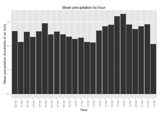
Something that I’ve noticed anecdotally is that it’s more likely for me to get caught in the rain on the way home than it is on my way into work. The data showed that rain in the late afternoon and evening is more common than rain in the morning.

Precipitation by hour

However, I couldn’t really find any information online as to why this may be the case, so it may just be a fluke.

Although not a new idea, I really like heat maps for climate data. This is a heat map wrapped in a circle using ggplot2‘s coord_polar() function that shows the month and hour of day. The innermost ring is the midnight hour and the outermost is 23:00. Darker shades indicate more precipitation.
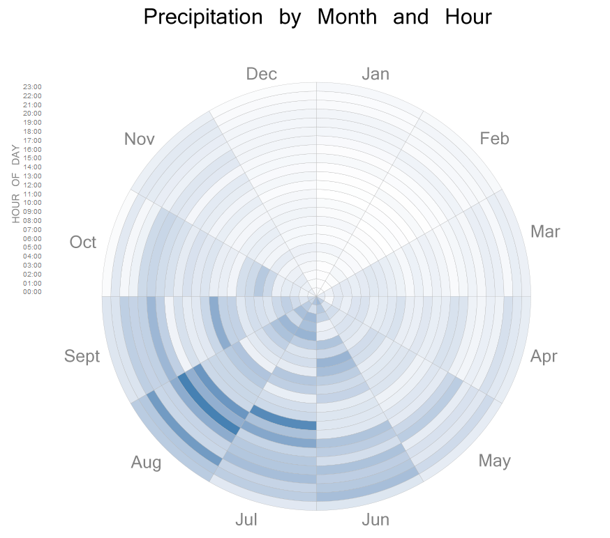
Heatmap of rain amount

Another Look at School Lunch Participation: Food Insecurity

We’re very fortunate in the U.S. to have high access to food and there are many social programs to help people who cannot afford food. That being said, food insecurity is still a problem for some families.

According to the USDA, “An estimated 85.1 percent of American households were food secure throughout the entire year in 2011, meaning that they had access at all times to enough food for an active, healthy life for all household members.”

I came across this data just after putting together my information on the National School Lunch Program and thought it would be interest to compare the two data sets. My hope was to see that states with more food insecurity would have more participation in the school lunch program.

This scatter plot compares lunch participation with food insecurity by state. The center of the graph is the national average. I chose to highlight the top left “danger zone” quadrant as these are the states with more food insecurity and less NSLP participation. You can mouseover any of the data points for the specifics of that state.

This is also my first time really getting into D3 so let me know if you have any feedback.

Drake and the Back of the Envelope

One of the many handy things about the math of probability is that we can simply stack probabilities of individual events to get the overall probability for the scenario. For example, the probability of a coin landing on heads is 0.5 and the probability of three heads in a row is 0.5 * 0.5 * 0.5. We can use this same principle to break down seemingly complex problems into smaller, more-manageable chunks.

A great example of this is Frank Drake’s eponymous equation. This equation is supposed to calculate the probability of alien civilizations in our galaxy. Of course we have no way of knowing this number, but the equations gives us several components that we can at least take a guess at.

  • the average rate of star formation per year in our galaxy
  • the fraction of those stars that have planets
  • the average number of planets that can potentially support life per star that has planets
  • the fraction of the above that actually go on to develop planetary life at some point
  • the fraction of the above that actually go on to develop intelligent life
  • the fraction of civilizations that develop a technology that releases detectable signs of their existence into space
  • the length of time for which such civilizations release detectable signals into space

If you want to play around with these numbers, the BBC has an interactive infographic about the equation.

Doing this type of rough estimate is often referred to as a “back of the envelope” estimate–the idea being that you are just jotting down numbers of a piece of scrap paper to get a quick answer. While inexact, this is actually a very useful exercise that when applied properly will give you a better idea of an actual number or probability.

Consider a meeting where you’re asked how many customers cancelled their accounts in 2012. You don’t have that number with you, but can you make a guess? It’s more likely that you know the number of customers who cancelled last week. If five customers cancelled and you don’t feel that number is particularly low or high, multiply that by the number of weeks in the year to get 260. Next you might want to knock off a few for growth if you company has more customers this year than last. So take off 3-5% and you can report an estimate of around 250. This is a lot better than “I don’t have any idea” or pulling a number out of no where.

Have you used this method before? What types of problems do you encounter where it is useful?

National School Lunch Program Participation

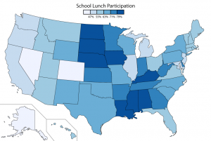
In the U.S. we have a national program for school children that allows them to get get reduced cost or free meals. Meals are available to all students and based on family income, some children are eligible for either free meals or reduced-cost meals that can be no more than $0.40. Recent data was released with last year’s numbers. However, I wanted to normalize the data based on population and the most recent numbers I could find for public school population were from 2008. This map shows the percent of students who participated in 2008.

Map of NSLP participation by state

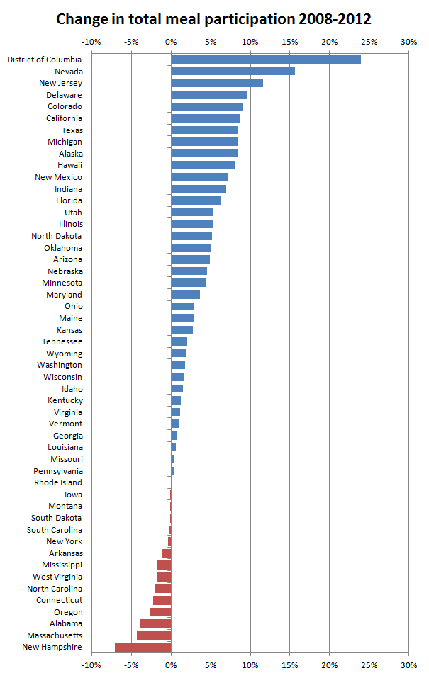
I also wanted to see which states were changing over time. I compared the 2008 numbers to 2012 numbers and then subtracted 3.23% to account for the overall U.S. population growth since 2008. Participation is up almost across the board.

Chart of NSLP participation 2008-2012

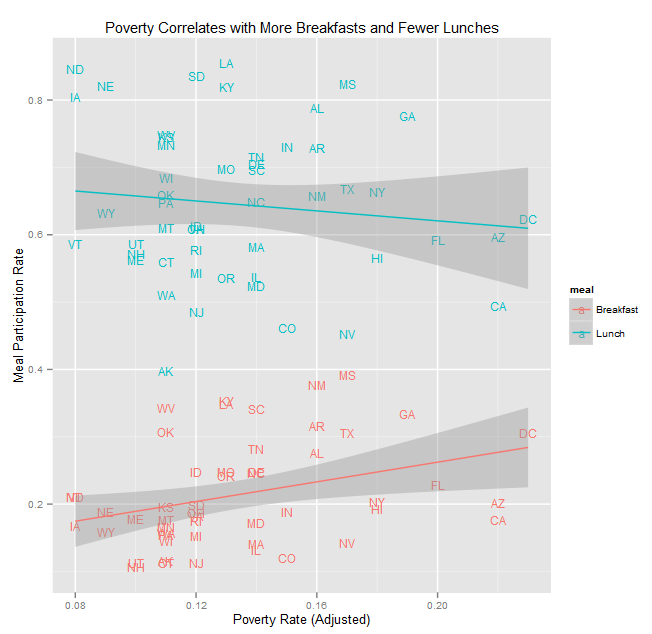
Because reduced-cost and free lunches are available, I wanted to see if there was a correlation between participation and poverty. Although the program is called the National School Lunch Program, breakfasts are also available at some schools. Breakfasts have lower participation in every state. Lunch participation has a per-state median of about 60% compared to 20% for breakfast participation. At first the correlation didn’t seem to be that strong, but on a whim I separated the data by meal type and saw this unique result:

Scatterplot correlation of poverty and meal participation

This is one of those head-scratcher moments where the data and intuition don’t align. I did some research on NSLP participation and as it turns out there are many factors at play that could be contributing to these results. For fear of stigmatization [PDF], not all school districts offer a breakfast. If only the most impoverished districts offer a breakfast, there is not access for all students. There are also cultural and peer stigmas that may dissuade students from participating. Another study [PDF] found that there are problems with both under-participation and over-participation: students who should qualify don’t use the program while students who should not qualify do use the program.

Since the national government has relatively little to do with pubic education, it is important for states and school districts to look into these types of issues on their own. I found many articles extolling the benefits of these programs and we should do everything possible to ensure students who need food assistance have access to it.

Chart Gimmicks: Spinning Charts

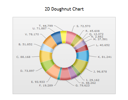
FusionCharts is a product that makes designing graphs and charts for the web simpler. It has some nice benefits: the charts can be Flash or JavaScript, they have a nice polished look, and they are very customizeable. Unfortunately, they make it very easy for designers to make bad graph choices.

I’m not going to rail on pie graphs since it has been done before [PDF]. Pie charts are a bit of a phenomenon in that they are really enticing to people, but ultimately aren’t very useful. But for some reason, FusionCharts goes one step further and adds a gimmick: their pie charts spin.

FusionChart: 2D Pie Chart

(OK, I know I said I wasn’t going to rail on pie charts, but this one isn’t even sorted! And I feel like they are admitting its useless by including all the data points.)

To see it in action, click here and take a look at their demos. Just click, drag and watch it go! How can you resist putting this in your next dashboard?

Nothing on their web site addresses this specifically, but my guess is that they chose to add this feature because interactive graphs are a big selling point of the suite. Now I’m all for interactive visualizations when they enhance the user experience, but I don’t see what spinning adds. It does not make the chart easier to read or highlight information, it’s just a gimmick.

As visualization designers, its our job to make data interesting and intriguing  Unfortunately, that often means steering clear of the default settings and wading through the gimmicks in software.