K-12 Schools in the United States Mapped

I’ve recently been seeing a lot of maps where things like tweets or McDonald’s locations are geocoded and plotted onto a map on the United States. Unfortunately, they usually all end up looking the same. We can see where the major population centers and roads are and not much else. Nonetheless, it is still kind of neat to see the U.S. “pop” into place without plotting cities or roads.

When I recently downloaded a data set from the Department of Education, I was happy to see that the schools were geocoded. I had no choice but to create one of these maps! There was the instant “Woah that’s cool” followed by “Well…I’ve seen this before” followed by “What else can I do with this?”. Below is a series of maps I created by adding colors to the plots. Each one links to a much higher resolution (4000px X 2000px) image. In general, I think the small images give you nice general overviews while the large images let you drill down to the city level. All plots were created with the ggplot2 package for R.

Free Lunch

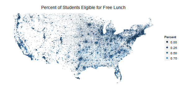
Some students are eligible for free lunch based on economic needs. This shows the percentage of students at each school who are eligible. See my other post for more data about this program.

Percent of students eligible for free lunch

School Type

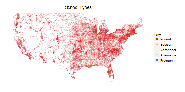
The DOE codes schools according to one of five types: Regular school, Special education school, Vocational school, Other/alternative school, Reportable program (new code starting in 2007–08). Louisiana and Michigan really stand out to me in this one.

DOE school type

Racial Plurality

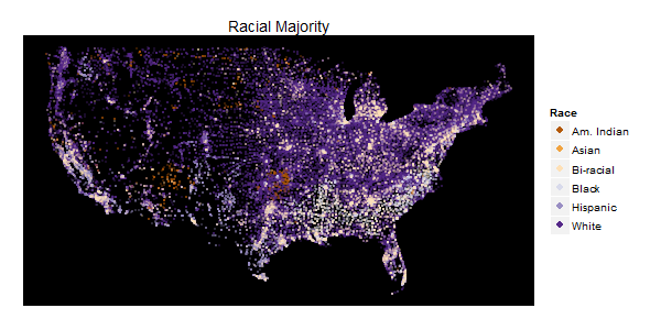
The DOE asks for schools population counts in the following categories: American Indian/Alaska Native, Asian, Hispanic, Black, White, Hawaiian Native/Pacific Islander, and Two or more races. I know there are a lot of problems with categorization this simple, but I think it can still give us a good snapshot of the U.S. population. The color of each point is determined by the population with the greatest plurality at the school. There are the traditional Black “crescent” in the South and Hispanic populations in the South. However, I found the “American Indian” and “Two or more races” data to be most interesting. I also chose to plot this on black, it seemed to pop a little better.

Racial plurality in US schools.

Where’s the love for Alaska and Hawaii? To be honest, I did try a few plots with them shrunk into the corner, but it really didn’t look appealing. Alaska is so sparse the points weren’t very visible and in contrast Hawaii is so small there isn’t much to see.

This is the basic code I used to generate a map. Feel free to use and change as you’d like.

library(ggplot2)
pessus<-read.csv("pessus.csv")
pessus48<-subset(pessus,pessus$LONCOD09>-150&LATCOD09<50&LATCOD09>20)

#FREE LUNCH
png("map.png",width=4000,height=2000)
ggplot(pessus48,aes(x=LONCOD09,y=LATCOD09,color=FRELCHPCT))+
  geom_point(alpha=.75,size=1)+
  theme(axis.ticks=element_blank(),
        line=element_blank(),
        panel.background=element_blank(),
        axis.title=element_blank(),
        axis.text=element_blank(),
        text=element_text(size = 36))+
  labs(title="Percent of Students Eligible for Free Lunch")+
  guides(color=guide_legend(override.aes=list(size=15,alpha=1)))+
  scale_color_continuous(name="Percent")
dev.off()

#SCHOOL TYPE
png("type.png",width=4000,height=2000)
ggplot(pessus48,aes(x=LONCOD09,y=LATCOD09,color=factor(TYPE09)))+
  geom_point(alpha=.75,size=1)+
  theme(axis.ticks=element_blank(),
        line=element_blank(),
        panel.background=element_blank(),
        axis.title=element_blank(),
        axis.text=element_blank(),
        text=element_text(size = 36))+
  labs(title="School Types")+
  guides(color=guide_legend(override.aes=list(size=15,alpha=1)))+
  scale_color_brewer(name="Type",palette="RdYlBu",type="diverging",
                     labels=c("Normal","Special","Vocational","Alternative","Program"))
dev.off()

#RACIAL PLURALITIES
#Note: MAXRACE was calculated by myself in Excel
png("race.png",width=4000,height=2000)
ggplot(pessus48,aes(x=LONCOD09,y=LATCOD09,color=factor(MAXRACE)))+
  geom_point(alpha=1,size=2)+
  theme(axis.ticks=element_blank(),
        line=element_blank(),
        panel.background=element_rect(fill="black"),
        axis.title=element_blank(),
        axis.text=element_blank(),
        text=element_text(size = 36))+
  labs(title="Racial Plurality")+
  guides(color=guide_legend(override.aes=list(size=15,alpha=1)))+
  scale_color_brewer(name="Race",type="diverging",palette="PuOr")
dev.off()

Plotting Seinfeld Episode Scores by Season Using ggplot2

I recently made a post over at reddit showing the IMDB scores of Seinfeld episodes by season. It got a lot of traffic, but as it turned out the data I was using was incorrect/outdated/malformed. I also got a lot of questions about how I made the graph. This post should help to answer those questions!

The Data

I got the revised data from IMDB. You can access a clean CSV version here.

Plotting in R with ggplot2

This is the plot we’re going to make:

Episode ratings by season

Here is the code used:

#Read the data into R
#I copied from excel, you can use read.csv() too
sf<-read.table("clipboard",sep="\t",header=T)

#Load ggplot2 
#(use install.packages"ggplot2" if you don't have it yet)
library(ggplot2)

#OPTIONAL
#Use the Cairo library for anti-aliased images in Windows
library(Cairo)
CairoWin()

#Make the plot

#Use aesthetics to set the axes and season coloration
#Note: By setting color here stat_smooth will plot separate fits

ggplot(sf,aes(x=c(1:nrow(sf)),y=Rating,color=factor(Season)))+
  geom_point()+
  #Use any method you like, loess is default but I specified lm
  stat_smooth(method="lm")+
  #Clean up
  labs(x="Episode #",y="Average Rating",title="Seinfeld Episode IMDB Ratings by Season",color="Season")+
  ylim(c(7,9))

Web Scraping and Corpus Analysis with Python: A Seinfeld Case Study

A few years ago, I discovered the hilarity that is Curb Your Enthusiasm. Good or bad, I see a lot of myself in Larry’s character. I kept seeing references to Seinfeld and of course culturally know it as a classic sitcom, but I’ve never seen more than an episode or two. I was probably too young when it was in its first run to get the humor, but by now, I feel I’m sarcastic and jaded enough to appreciate the show.

I decided to use Python to scrape scripts from the show and then get the words to do a basic corpus analysis. By comparing the dialogue of Seinfeld episodes to the dialogue of other English TV shows, I hoped to see what topics are more common in Seinfeld.

Here are some of the words with the most abnormally high distribution in the Seinfeld corpus:

  1. Twix
  2. Armoire
  3. Denim
  4. Biologist
  5. Pakistani
  6. Taps
  7. Yearn
  8. Calzone
  9. Wiz
  10. Holistic

If you are interested in doing something like this for yourself, these are the methods I followed. There may be better ways of coding this since my Python-fu isn’t great yet, but it worked for me and I hope others learning Python may be able to glean something from this.

Web Scraping with Python

First you’ll need to install the BeautifulSoup library. This will allow you to scan the HTML structure of a webpage easily. The website I used for this Seinology. I chose this site because the URLs for every episode are in the same format, making it simple to loop through them. Here’s the code to pull the data.

from bs4 import BeautifulSoup
import urllib2
import sys

sys.setrecursionlimit(2000)

f = open("data1.txt","a")
f.truncate()

def getStuff(script):
	try:
		#Load the content from the url into a BeautifulSoup object
		url = urllib2.urlopen("http://www.seinology.com/scripts/script-" + script + ".shtml")
		content = url.read()

		soup = BeautifulSoup(content)

		#Navigate DOM and find what I want
		p = soup.find_all("p")
		f.write(str(p[3]))
		print "Done with script " + script
	except:
		print "Unable to open script " + script

#Looping through each of the script numbers
lownums = ["01","02","03","04","05","06","07","08","09"]
for num in lownums:
	getStuff(num)

for i in range(10,177):
	getStuff(str(i))

f.close()

Let me explain lines 19 and 20 in a little more detail. First I looked at the HTML source of the webpage and found that the script contents are inside of an unnamed <p> tag. Furthermore, that <p> is always the 4th <p> in the document. On line 19 I use the soup.find_all("p") method to load the contents of each <p> into an object. In line 20, I write the 4th item of the list into my file. Your specific webpage will of course be different but the BeautifulSoup documentation is very thorough.

Building the Corpora

Now that I have the data, I can start to parse it. The basic idea of this code is to select only dialogue lines, then split every word, remove punctuation, and count the number of times each word occurs. This is a perfect use for a dictionary structure. (I used this code as a model for my code.)

f = open("data2.txt","r")

#Only look at dialogue lines which always have a colon.
#Not perfect, but good enough.
text = ""
for line in f:
	if ':' in line:
		text = text + line

f.close()

punctuationMarks = ['!',',','.',':','"','?','-',';','(',')','[',']','\\','/']

dict = {}
words = text.lower().split()

for word in words:

	for mark in punctuationMarks:
		if mark in word:
			word = word.replace(mark,"")

	if word in dict:
		dict[word] += 1
	else:
		dict[word] = 1

f = open("counts.txt","w")
f.truncate()

for word, count in dict.items():
	f.write(word + "\t" + str(count) + "\n")

f.close()

Finally I had some corpus data to work with! But what I wanted to see is what words are more common in Seinfeld episodes than normal dialogue. Serendipitously, Wiktionary actually has an English frequency list based off of TV scripts. I copied that list through word #22000 into another file and then wrote a third Python script to compare the two corpora. (I did do a bit of cleanup first to remove blanks and some stray HTML, hence different file names).

f = open("sranks.txt","r")

sranks = {}

#Split each line into the word and the count
for line in f:
	pair = line.split()
	word = pair[0]
	value = pair[1]
	sranks[word] = value

f.close()

f = open("eranks.txt","r")

eranks = {}

for line in f:
	pair = line.split()
	word = pair[0]
	value = pair[1]
	eranks[word] = value

f.close()

f = open("compare.txt","w")
f.write("Word\tSRank\tERank\n")
for word, count in sranks.items():
	if word in eranks:
		f.write(word + "\t" + str(count) + "\t" + str(eranks[word]) + "\n")

f.close()

This script ran surprisingly fast–about 4 seconds on an i5 3.20GHz processor.

Are there more countries now than there used to be?

This question came to me out of no where one day. It’s simple, but brings up some interesting ideas. Obviously at one point there would have been just a handful of countries, but over time more and more were created. In modern history, when did the number of countries peak? Has the number risen and fallen? Has it steadily grown?

Thankfully Wikipedia has a list of the number of countries for every year from 1800-1959. In case you didn’t know, Wikipedia has a list of just about everything.

I wrote a python script to grab the data from these pages. Then for the years after 1960, I used this Wikipedia list to add and subtract countries for each year.

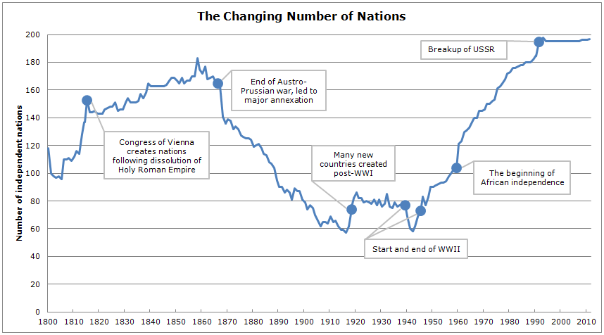
Plotting the data led to this interesting chart. I made some annotations of key points that led to a steep increase or decrease.

Plot of number of nations

The most obvious problem with this is who defines what a nation is? Many nations are not recognized immediately and even today different nations choose to not recognize other nations. Additionally, the lists on Wikipedia are almost certainly incomplete. Nonetheless, I feel the numbers are at least reasonably accurate and point out some interesting periods in world history.

A Different Look at the “Rising Age of Marriage”

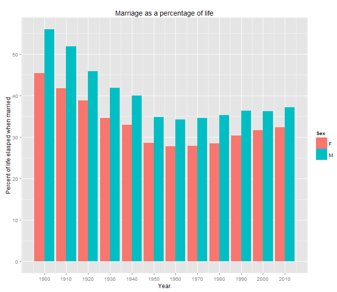
It’s well known that people in the U.S. are getting married later in life. Today I heard that same fact on the SYSK Podcast, but it struck me that we’re also living longer. Sure we’re getting married later in terms of age, but what percent of our lives go by before we get married?

I compiled the data from here and here and graphed the ratio of age at first marriage compared to life expectancy.

Graph of life elapsed before marriage

So yes, looking at the past few decades it seems that more of our lives are elapsing before getting married, but nothing compared to the earlier part of the century. A typical man in 1900 married after half of his life was already over.