Creating Voronoi Diagrams with ggplot
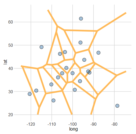
A Voronoi diagram (or tessellation) is neat way of visualizing spatial data. It essentially allows us to see the areas that are closest to a set of locations. For example, this map shows all of the Criagslist localities and the regions closest to each Craigslist locality. More formally, “A set of points (called seeds, sites, or generators) is specified beforehand and for each seed there will be a corresponding region consisting of all points closer to that seed than to any other.” (Wikipedia) A handy library for plotting these in R is deldir. After installing that library (and ggplot2 if you don’t already have it), plotting a Voronoi diagram is simple.
#Let's generate some fake data
set.seed(105)
long<-rnorm(20,-98,15)
lat<-rnorm(20,39,10)
df <- data.frame(lat,long)

library(deldir)
library(ggplot2)

#This creates the voronoi line segments
voronoi <- deldir(df$long, df$lat)

#Now we can make a plot
ggplot(data=df, aes(x=long,y=lat)) +
    #Plot the voronoi lines
    geom_segment(
        aes(x = x1, y = y1, xend = x2, yend = y2),
        size = 2,
        data = voronoi$dirsgs,
        linetype = 1,
        color= "#FFB958") +
    #Plot the points
    geom_point(
        fill=rgb(70,130,180,255,maxColorValue=255),
        pch=21,
        size = 4,
        color="#333333") +
    #(Optional) Specify a theme to use
    ltd_theme
You should end up with something like this:
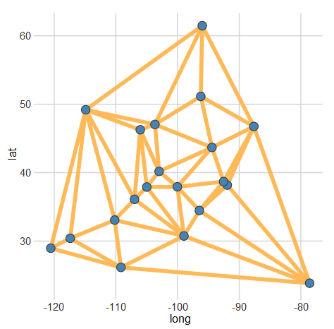
Additionally, if you would prefer the Delaunay triangulation (which connects all of the sites), you just need to change voronoi$dirsgs to voronoi$delsgs in the line segment part of the plot. Here’s what that should look like:
I have not found a fully automated solution to combine these plots with a map. However, using the ggmap library can get you pretty close.