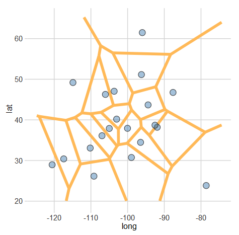
A Voronoi diagram (or tessellation) is neat way of visualizing spatial data. It essentially allows us to see the areas that are closest to a set of locations. For example, this map shows all of the Criagslist localities and the…
What factors determine if a university’s alumni will donate?
Last week, I caught a post on reddit from Vizual Statistix where data on university alumni giving rates was plotted. The graph was very polished and I saw there were a lot of factors plotted. The main correlation that better…
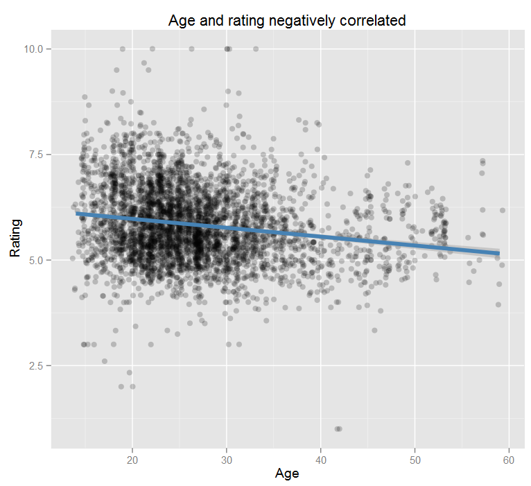
Predicting Attractiveness on RankMyPhoto
To be honest, RankMyPhoto is a pretty skeezy website. It encourages objectification and seems like a big cry for attention. The premise is you upload a photo of yourself and anonymous internet users can rank your attractiveness and also vote…
K-12 Schools in the United States Mapped
I’ve recently been seeing a lot of maps where things like tweets or McDonald’s locations are geocoded and plotted onto a map on the United States. Unfortunately, they usually all end up looking the same. We can see where the…
Plotting Seinfeld Episode Scores by Season Using ggplot2
I recently made a post over at reddit showing the IMDB scores of Seinfeld episodes by season. It got a lot of traffic, but as it turned out the data I was using was incorrect/outdated/malformed. I also got a lot…