What factors determine if a university’s alumni will donate?
Last week, I caught a post on reddit from Vizual Statistix where data on university alumni giving rates was plotted. The graph was very polished and I saw there were a lot of factors plotted. The main correlation that better ranked universities have higher giving rates was obvious, but I wasn’t so sure about the other factors. I wanted to see what a predictive analysis would reveal so I asked for the data and was happy to be pointed in the right direction. There are a lot of variables in this data set and I chose to use a random forest to help me decide which variables were relevant. A random forest model builds hundreds of decision trees and then selects the best tree from the “forest”. A nice feature of the randomForest package for R is that it provides a nice list of the variables and their importance in predicting the model. The top five factors are as follows:
- Applicant acceptance rate (lower acceptance is better)
- U.S. News University Rank (better rank is better)
- Average need-based scholarships or grants for full-time undergraduates (more money is better)
- Six-year graduation rate (higher graduation is better)
- Freshman retention rate (higher retention is better)
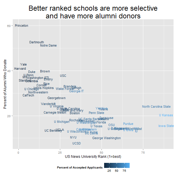
Obviously many of these variables are related. In general, better schools are more selective, have more committed students, etc. In fact, this data confirms pretty well what we would suspect–alumni are more likely to give if they went to a good school. In keeping with the vibe of the Vizual Statistix post, I chose to plot the giving rate with the US News Rank. However, in place of the religious affiliation and public/private ownership factors, I used color to show the acceptance rate. I also used short names of the universities in place of plot points. This is a technique I have loved since I first saw it in this post by Andrew Gelman. (Click to embiggen.)
Here is example code that you can run to generate this graph for yourself. I also included the random forest code. It really is that easy to build the model!
#Read in the data
unis<-read.csv(url("https://www.dropbox.com/s/1pi7crj6zmhhsl6/university_rankings.csv"))

#install.packagaes("randomForest")
library(randomForest)

#Create your model. Keep in mind any row with an NA will not be used in the model.
#For my model, I picked variables with lots of data
rfunis<-randomForest(AlumniGivingRate ~ USNewsRank+Control+Founded+Undergrads+Setting+
    StudentsPerFaculty+ClassesFewer20Students+ClassesMore50Students+SixYearGradRate+
    InStateTuition+OutStateTuition+RoomAndBoard+NeedBasedGrant+SelfHelpAid+
    NeedMetPercent+FinancialAid+NeedBasedScholarship+NeedBasedLoan+Selectivity+
    Acceptance+Applicants+FreshmanRetention+FraternityPercent+SororityPercent+
    OffCampusUndergrad,
    data=unis, na.action=na.omit)

#Print the importance of each variable in the model, sorted
rfunis$importance[order(rfunis$importance,decreasing=T),]

#Make the plot
library(ggplot2)
png("scatterplot.png",width=600,height=600)
ggplot(unis,aes(x=USNewsRank,y=AlumniGivingRate*100,label=Sname))+
    geom_text(aes(color=Acceptance*100),size=4)+
    labs(x="US News University Rank (1=best)",y="Percent of Alumni Who Donate",
         title="Better ranked schools are more selective\nand have more alumni donors",
         color="Percent of Accepted Applicants")+
    theme(legend.position="bottom",
          plot.title = element_text(size = rel(2)))
dev.off()
