Last week I gathered some data from RankMyPhoto, but I was disappointed to see that eye and hair color were free response questions instead of drop down questions.
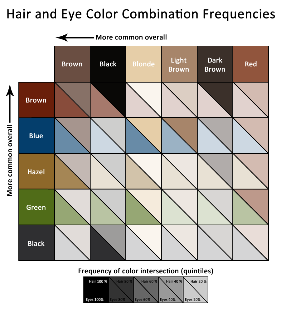
However, I got a great suggestion from a reddit user to use OpenRefine to try and consolidate some of the similar data. I was really happy with the results and was able to get some good, clean factors. To make it more usable, I also took some liberties on simplifying some of the more descriptive colors into simpler categories. I then fed that data back into R to make correlation tables. The result of this is the following graphic.
My primary goal was to show the correlation through the actual colors. A heatmap does this well, but because the percentages are so low in general, it ended up looking too pale and washed out. The quantiles helped to make sure even the lower percentages were still visible. Finally, I determined the quantiles according to their relative rank in each row or column instead of overall. Thus, for example, even though red hair is the rarest, you can still see the red/green square pop which you wouldn’t in a true overall heatmap.

