Programming languages are often described in terms of paradigms or features. This naturally leads to families of closely-related languages. By using a clustering algorithm, we can visualize how closely any two languages are related. This dendrogram places languages in a…
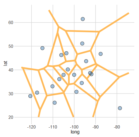
Creating Voronoi Diagrams with ggplot

A Voronoi diagram (or tessellation) is neat way of visualizing spatial data. It essentially allows us to see the areas that are closest to a set of locations. For example, this map shows all of the Criagslist localities and the…
Finding the colors used in graffiti through clustering
Earlier this week, a Graffiti “museum” of sorts in New York was destroyed. Graffiti artists from around the world came to contribute to the ever-changing murals at 5Pointz. To combine millions of colors into just 32 obviously removes a lot…
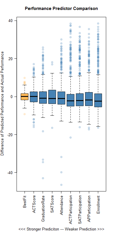
Predicting Performance at Ohio High Schools

The Ohio Department of Education recently released new statistics for school performance. The big news surrounding them was the inclusion of letter grades. However, overall letter grades will not go into effect until 2015. Until then, there are still some…
What factors determine if a university’s alumni will donate?
Last week, I caught a post on reddit from Vizual Statistix where data on university alumni giving rates was plotted. The graph was very polished and I saw there were a lot of factors plotted. The main correlation that better…
