Finding the colors used in graffiti through clustering
Earlier this week, a Graffiti “museum” of sorts in New York was destroyed. Graffiti artists from around the world came to contribute to the ever-changing murals at 5Pointz.
To combine millions of colors into just 32 obviously removes a lot of variation and vibrancy. But still, this graph gives a strong indication of the overall palette used. For example, notice the inclusion of bright pinks and blues in spite of removing the noise. I’ve seen average color analyses before and the idea inspired me to investigate the colors present at 5Pointz. The official website has a lot of great photos. I grabbed about a hundred, cropped out sidewalks, sky, etc. and processed them through Python to get the RGB data for each of the pixels. The Python Imaging Library makes this super easy.
import Image

rgb_counts = {}

def get_img_details(image_name):
    image = Image.open("./images/" + image_name)
    width = image.size[0]
    height = image.size[1]
    pixels = image.load()

    for x in range(width):
        for y in range(height):
            rgb = pixels[x,y]
            if rgb_counts.get(rgb):
                rgb_counts[rgb] += 1
            else:
                rgb_counts[rgb] = 1
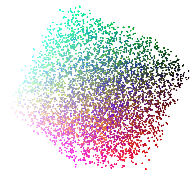
After doing this, there were over 2.5 million unique colors. With so much noise, I wanted to pare down the data to create something visual. For this, I turned to clustering in R to get “average” color pockets. After clustering, the clusterplot function in the fpc library makes this interesting visual of 5000 randomly sampled points.
You can see shades of similar colors grouped together. Finally, I took the red, green, and blue means of each of the clusters to create the graph above. Full code for this is available here and here.
