Review: Udacity Tales from the Genome (BIO110)

Until recently, Udacity has specialized in technical courses. However, late last year they released Tales from the Genome, an introductory course on genetics. I was a bit skeptical of how the material would be presented, but I was interested enough in the subject to give it a shot.

The first thing I noticed about this course were the varied types of video. Although some of the lecture content is in the traditional Udacity style of whiteboard instruction, this course includes “in-person” lectures with instructors Matt and Lauren, interviews with professionals in the field, and discussions with everyday people who have some sort of genetic story relevant to the course. I like this idea, but I found the quality of the content to vary widely. Most of the interviews with professionals were interesting, but many of the “everyday person” discussions were not engaging. For example, they spoke to one woman who has a family history of sickle cell anemia, but didn’t seem to be well informed of how the disease actually affected herself, her family, or her community. Or in an another case they spoke with an adopted man who was searching for his biological parents. While his story was intriguing, there was no conclusion and the closest he came to finding a parent is locating some people near his hometown with a last name that could be the last name of one of his parents. Not exactly riveting. While I appreciate that these are real people sharing their stories, I feel the content would have been more interesting if Udacity had spent some additional time vetting the people before deciding to include them in the lecture content.

This additional video content makes the overall length of the course longer than the other Udacity courses I’ve taken. The video time runs about 13 hours and the quizzes and exams make for about 15-20 hours of total time involvement. The quizzes are mostly multiple choice questions, although some of them are short-response and/or include a “Why?” textbox. I like the idea behind this–there is no one grading the free responses but it encourages students to think about their answers. However, because there is so little feedback, I occasionally found myself skipping those questions by entering bogus text. While the short response questions weren’t as effective for me as intended, I do encourage Udacity to keep experimenting with alternate methods of assessment. Their code analysis/checker is phenomenal and it would be great if they could do something similar for non-technical classes. The only gripe I have about the multiple choice questions is that sometimes I did not know the answer and there’s not always a clear way to find the correct answer. I would love a “I don’t know” button that would mark the question as wrong but then give the answer with an explanation. The only other option now is to try all the combinations and then be confused by the correct answer.

Probably my favorite thing about this course was the wide variety of material. It was an entry level course with a lot of breadth and little depth, but I felt like it gave me an interesting look at many questions and problems in genetics today.

A final note: This course is sponsored by 23andMe, a genetic testing company. I was already a 23andMe customer before taking this course, but non-customers might feel like they are being advertised to. The inclusion of 23andMe marketing information is subtle and well-integrated with the course syllabus, but may turn off some people looking for a “pure” educational experience.

Overall I did enjoy this class, mostly due to the information that I learned. However, it still felt a little “beta” to me. I am excited to see Udacity branch out from technical courses, but the model used in Tales from the Genome isn’t quite polished enough for me to completely endorse it.

How to use the Yelp API in Python

In last week’s post, I pulled data about local restaurants from Yelp to generate a dataset. I was happy to find that Yelp actually has a very friendly API. This guide will walk you through setting up some boiler plate code that can then be configured to your specific needs.

Step 1: Obtaining Access to the Yelp API

Before you can use the Yelp API, you need to submit a developer request. This can be done here. I’m not sure what the requirements are, but my guess is they approve almost everyone. After getting access, you will need to get your API keys from the Manage API access section on the site.

Step 2: Getting the rauth library

Yelp’s API uses OAuth authentication for API calls. Unless you want to do a lot of work, I suggest that you use a third party library to handle the OAuth for you. For this tutorial I’m using rauth, but feel free to use any library of your choice.

You can use easy_install rauth or pip install rauth to download the library.

Step 3: Write the code to query the Yelp API

You’ll first need to figure out what information you actually want to query. The API Documentation gives you all of the different parameters that you can specify and the correct syntax.

For this example, we’re going to be doing some location-based searching for restaurants. If you store each of the search parameters in a dictionary, you can save yourself some formatting. Here’s a method that accepts a latitude and longitude and returns the search parameter dictionary:

def get_search_parameters(lat,long):
	#See the Yelp API for more details
	params = {}
	params["term"] = "restaurant"
	params["ll"] = "{},{}".format(str(lat),str(long))
	params["radius_filter"] = "2000"
	params["limit"] = "10"

	return params

Next we need to build our actual API call. Using the codes from the Manage API access page, we’re going to create an OAuth session. After we have a session, we can make an actual API call using our search parameters. Finally, we take that data and put it into a Python dictionary.

def get_results(params):

	#Obtain these from Yelp's manage access page
	consumer_key = "YOUR_KEY"
	consumer_secret = "YOUR_SECRET"
	token = "YOUR_TOKEN"
	token_secret = "YOUR_TOKEN_SECRET"
	
	session = rauth.OAuth1Session(
		consumer_key = consumer_key
		,consumer_secret = consumer_secret
		,access_token = token
		,access_token_secret = token_secret)
		
	request = session.get("http://api.yelp.com/v2/search",params=params)
	
	#Transforms the JSON API response into a Python dictionary
	data = request.json()
	session.close()
	
	return data

Now we can put it all together. Since Yelp will only return a max of 40 results at a time, you will likely want to make several API calls if you’re putting together any sort of sizable dataset. Currently, Yelp allows 10,000 API calls per day which should be way more than enough for compiling a dataset! However, when I’m making repeat API calls, I always make sure to rate-limit myself.

Companies with APIs will almost always have mechanisms in place to prevent too many requests from being made at once. Often this is done by IP address. They may have some code in place to only handle X calls in Y time per IP or X concurrent calls per IP, etc. If you rate limit yourself you can increase your chances of always getting back a response.

def main():
	locations = [(39.98,-82.98),(42.24,-83.61),(41.33,-89.13)]
	api_calls = []
	for lat,long in locations:
		params = get_search_parameters(lat,long)
		api_calls.append(get_results(params))
		#Be a good internet citizen and rate-limit yourself
		time.sleep(1.0)
		
	##Do other processing

At this point you have a list of dictionaries that represent each of the API calls you made. You can then do whatever additional processing you want to each of those dictionaries to extract the information you are interested in.

When working with a new API, I sometimes find it useful to open an interactive Python session and actually play with the API responses in the console. This helps me understand the structure so I can code the logic to find what I’m looking for.

You can get this complete script here. Every API is different, but Yelp is a friendly introduction to the world of making API calls through Python. With this skill you can construct your own datasets from any of the companies with public APIs.

Restaurants Closer to Columbus’ Population Center are Better

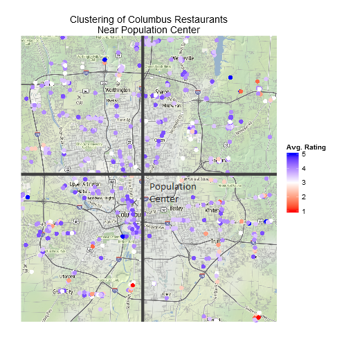
Map of Columbus restaurants

Click to enlarge

Following my last post on Ohio’s population center, I wanted to get a bit more local. My home town of Columbus has a unique population characteristic: the population is almost uniformly dense. Despite this, I know from personal experience that many of the best restaurants are relatively centrally located in the city. To investigate this further, I used the Yelp API to query information about restaurants in the metro area.

Included in the restaurant details, Yelp provides the latitude and longitude of the restaurant. To find the distance from Columbus’ population center, I used Mario Pineda-Krch’s R implementaion of the Spherical Law of Cosines:

resto<-read.table(".\\data\\restaurants.txt",header=T,sep="\t")
#Exclude restaurants with few ratings
resto<-subset(resto,resto$reviews>2)

oh<-read.table("..\\ColsPop\\data\\data.txt",header=T,sep="\t")
#Arbitrary coordinates the generally bound the Columbus metro area
col<-subset(oh,oh$y < 40.15 & oh$y > 39.85 & oh$x > -83.15 & oh$x < -82.8)
#Note we don't need to correct for longitude
#convergence for small regions
colsCenter <- c(sum(col$num * col$x)/sum(col$num)
				,sum(col$num * col$y)/sum(col$num))

# Calculates the geodesic distance between two points
# specified by radian latitude/longitude using the
# Spherical Law of Cosines (slc)
gcd.slc <- function(long1, lat1, long2, lat2) {
  R <- 6371 # Earth mean radius [km]
  d <- acos(sin(lat1)*sin(lat2) + cos(lat1)*cos(lat2) * cos(long2-long1)) * R
  return(d) # Distance in km
}

deg2rad <- function(deg) return(deg*pi/180)

resto$distToCenter <- gcd.slc(deg2rad(colsCenter[1])
						,deg2rad(colsCenter[2])
						,deg2rad(resto$lon)
						,deg2rad(resto$lat))

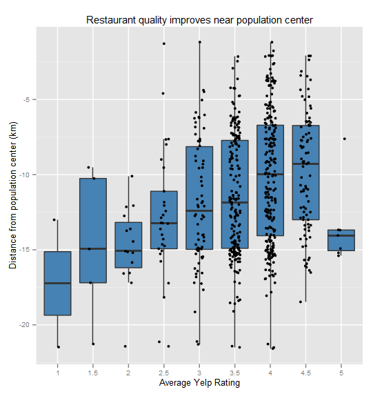
My hypothesis was that better-rated restaurants would be closer to the population center. A simple linear model confirmed this: For each kilometer closer to the population center a restaurant can expect about a .03 increase in average rating, significant at p << 0.001. To be clear, this is not a predictive model as there are many other factors that I would expect to more significantly impact a restaurant's rating. Nonetheless, this correlation with centrally is interesting.Restaurant ratings improve when closer to population centerStay tuned for details on using the Yelp API!

Population Center of Ohio

Population Center of Ohio

Click to enlarge

There are a few different ways of determining a population’s center, but the method I used for this graph is the one currently used by the Census [PDF]. If every person were the same weight, where would the balancing point be? Mathematically, it’s the average latitude (λ) and longitude (Φ) of every person’s position (with a correcting factor for the convergence of longitude.)Equation describing population centerI found Brandon Martin-Anderson’s details about his census dot-map very helpful, although I used my own method to process the data since I didn’t need his level of detail.

The Census provides shapefiles at their FTP here that describe each Census block (their smallest geographic unit). You can download them all or pick a specific state by looking up its FIPS code.

Next, I processed the shapefile in Python using the shapefile library. This script loads each census block (a shape within the file), finds its average latitude and longitude, and extracts the number of people in that particular block. Finally all the data is printed into a text file for final processing in R.

import shapefile

def main():
	sf = shapefile.Reader("D:\\oh_shape")
	shapes = sf.shapes()
	records = sf.records()
	
	rows = []
	
	for i in range(len(shapes)):
		id = records[i][4]
		location = get_average_lat_lon(shapes[i].points)
		num = records[i][7]
		rows.append(Row(id,location,num))
		
	f = open("..\\data\\data.txt","w")
	f.write("id\tx\ty\tnum\n")
	
	for r in rows:
		f.write("{}\t{}\t{}\t{}\n".format(r.id,r.location[0],r.location[1],r.num))

	f.close()
	
def get_average_lat_lon(points):
	x = []
	y = []
	for p in points:
		x.append(float(p[0])) #The longitude component
		y.append(float(p[1]))	#The latitude component
		
	return sum(x)/float(len(x)),sum(y)/float(len(y))

class Row:
	def __init__(self, id, location, num):
		self.id = id
		self.location = location
		self.num = num

if __name__=="__main__":
	main()

The R script is even shorter, basically a line to read the data, a line to calculate the averages, and then the ggplot output.

oh<-read.table("data.txt",header=T,sep="\t")
ohCenter <- c(sum(oh$num * oh$x *cos(oh$y))/sum(oh$num * cos(oh$y)),sum(oh$num * oh$y)/sum(oh$num))

library(ggplot2)
png(filename="..\\images\\ohio_population_center.png",
    width=2100,height=2000,units="px",pointsize=24,type="cairo")
ggplot(oh,aes(x=x,y=y))+
  geom_point(aes(size=num),alpha=0.50)+
  geom_hline(y=ohCenter[2], color="steelblue", size=3)+
  geom_vline(x=ohCenter[1], color="steelblue", size=3)+
  #coord_fixed()+
  theme(panel.background = element_rect(fill="white",color="white"),
        text = element_text(size=32),
        axis.text = element_blank(),
        axis.ticks = element_blank(),
        panel.grid = element_blank())+
  scale_size_continuous(name="People per block")+
  labs(x="",y="",title="Population Center of Ohio")
dev.off()

This map really shows the sprawl of the three largest cities in Ohio and solidifies the concept of “metro area”. When you look at the large version of the map, you can also notice some interesting oddities. For example, to the southwest of Columbus there is a large dot seemingly in the middle of nowhere. I first thought this was an error, but when I plugged the coordinates into Google Maps, I found the Orient prison. What other inferences can you draw about population from this map?

Opening moves in the game of Go: Fuseki Stats

Go (or weiqi or baduk) is an extremely popular strategy game in East Asia that became more popular in the West during the last century. I first came across it several years ago and have played on an off since then, mostly on the KGS server. The concept is relatively simple: control spaces on the board for points. The game ends when both players pass and agree there are no moves worth playing and points are tallied. However, because of the large game space and limited rules for legal moves, any given game state may have dozens or even hundreds of legal moves. This is a major factor as to why the best Go computer AI is still easily defeated by professional and high-level amateur players.

The first few moves of the game are the opening or fuseki. While there are no set rules for the opening, general guidelines are usually followed that result in similar openings for most games. A very handy website fuseki.info aggregates data from online Go servers and can be used to produce this “most-common” fuseki:Most chosen first six movesThis shows the common preference to play near the edges of the board early to attempt securing territory in the corners and sides of the board.

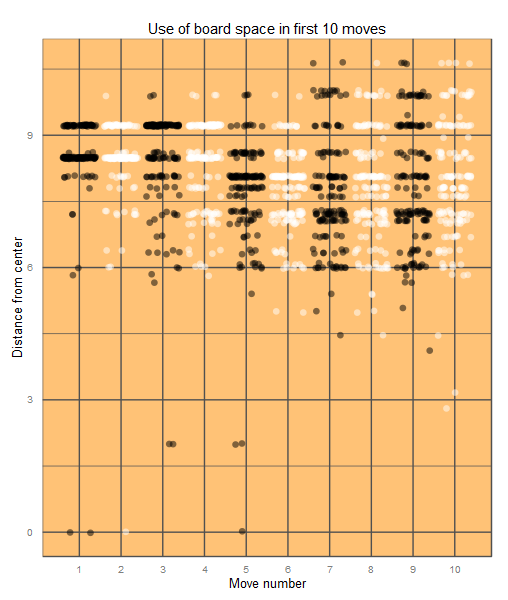
I downloaded several high-level amateur games from the KGS archives and parsed out the first few moves. This board heatmap of the first six moves shows the relative popularity of each point. Again we see a general preference for the corners, but a few games had non-traditional plays near the center.Heatmap of first six movesI was curious to see if there was a trend among the different moves so I next calculated the distance from the center of the board to each play made. This scatter plot compares distance from center to the move number (e.g. 7th move in the game). The colors are only a visual cue to show the alternating black-white plays. Finally, I added jitter since the x-axis is all integer data.Scatterplot of the opening 10 moves in GoNote that the first four moves are highly clustered and similar, then moves six and seven cluster a bit more towards the center, and moves seven through ten diverge from the opening moves in both directions. Also we can see that some players are willing to take risks early on by playing in the middle, but no one ever plays the extreme edge moves that pop up starting at move seven.

This semi-fixed strategy in the opening makes it possible for Go AI to cut down on calculations early on. It would likely be impractical and too time expensive to calculate best moves using a search tree when the board is so open. Instead, the fuseki seem like a good candidate for applying heuristic rules instead of probability algorithms. If you want to play around with your own variations, I definitely recommend fuseki.info or playing your own games on the KGS Server! There’s also always a couple of bots on the server to experiment with that span a range of difficulties. And if you’re interested in a technical implementation, GNU Go is a good place to start.