Distribution of U.S. Infant Birth Weights

I recently attended a talk by the co-author of this paper, Dr. James Collins. He shared a figure from this paper in his presentation that showed American black mothers give birth to lower weight babies than both American white mothers and foreign-born black mothers.

Since the data is from the early 1990s, I wanted to find some more recent data and create a similar plot. The CDC releases vital statistics information for all U.S. births and I used the most recent data set (2012). In 2012 there were over 3.5 million births, 3,637,278 of which I included in this plot.

Density plot of U.S. infant birth weightsIt may seem like these distributions are similar, but the differences between them are quite significant. Tukey-adjusted p-values are as follows:

Categorydifflowerupperadjusted p
Foreign Black-American Black95.6761214.08538177.26680.0165018
White-American Black223.57396221.66927225.47870.0000000
White-Foreign Black127.8978546.32161209.47410.0006971

It is unfortunate that the U.S. has so many more per-capita infant deaths than other comparable nations. While the problem is not isolated to one race, black women are significantly more likely to experience an infant death than white women. If you’re interested in learning more about current theories about the issue, this NPR article offers a good summary.

Review: Coursera Machine Learning

Although not as much of a buzzword as “Big Data”, “Machine Learning” is definitely en vogue. To be honest, the phrase sounds much more exotic than the actual technique! Nonetheless, the area of artificial intelligence interests me so I decided to take this class in order to learn more about the use cases of machine learning algorithms. Unfortunately, I finished the class feeling like I had not learned much at all.

Don’t take this the wrong way–I was certainly exposed to a lot of material. In fact, perhaps the best aspect of this class was the breadth of the course content. Many major algorithms are explored and several fundamentals of machine learning are covered. However, I found it very difficult to retain this information and was forgetting even simple concepts from week to week.

It can be difficult to engage students via an online video, but sadly this class felt like it wasn’t even trying. The segments of the videos where the professor is visible look and sound like they were recorded in a closet using a webcam from the early 2000s. The rest of the videos are essentially powerpoint presentations with some annotations. I should mention that this course is taught by the founder of Coursera, Andrew Ng. Therefore, I would have thought that Coursera would want to make the Machine Learning class a “flagship” class for the website. Instead it seems like this was likely one of the first Coursera classes and no one has thought to go back and revise the content.

The assignments for the class consisted almost entirely of algorithm implementation. While this is likely a philosophical decision of the course designers, I don’t really see the benefit. When I work with machine learning algorithms such as k-means clustering, I have no reason to think I can write a better implementation than professionals can. In almost all cases, it’s better to use a library for complex algorithms than it is to roll your own. I would have preferred the assignments to focus more on using the algorithms instead of implementing them.

By design, MOOCs require students to be more self-motivated and dedicated than traditional classrooms. I’m sure that if I had put in more effort into the quizzes and homework assignments, I would have retained more information. However, the quality of the instructional videos and the uninspired content made taking Machine Learning feel like a chore. While I like to see myself as a lifelong learner, this class gave me a bad case of senioritis: “How long until I graduate from lifelong learning?”

Programming language similarity

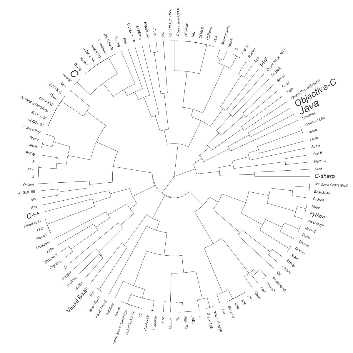
Programming languages are often described in terms of paradigms or features. This naturally leads to families of closely-related languages. By using a clustering algorithm, we can visualize how closely any two languages are related. This dendrogram places languages in a tree that is similar to a family tree. All of the languages are siblings or cousins of the same generation. Languages with closer common ancestors are more paradigmatically similar than those with more distant common ancestors. The size of the name represents the language’s relatively popularity.Fan dengrogram showing programming language paradigm similarityTo produce this, I first gathered the feature information from Wikipedia, language popularity from the Tiobe index, and modified all the data into a single table of features (data available here). In R, I used the clara library to create a distance matrix, hclust to create the clusters, and ape to make the visualization.

lang<-read.table("clipboard",sep="\t",header=T)
library(cluster)
cl_main <- clara(lang[,3:25],4) #Exclude name and popularity
to_cluster <- cl_main$data
to_cluster[,5:11] <- to_cluster[,6:12]*5 #Add some weight to certain paradigms
hc<-hclust(dist(to_cluster),method="complete")
hc$labels <- lang$Language
library(ape)
myph<-as.phylo(hc)
myph$tip.label <- as.character(myph$tip.label)
png(filename="programming_language_dendo.png",
    width=1500,
    height=1500,
    units="px",
    pointsize=12,
    type="cairo")
plot(myph, type="fan",
     cex = pmax(1.0,log(lang$Popularity+.01)),
     label.offset = 0.25,
     tip.col="#333333",
     no.margin=T)
dev.off()

Since the comparison explicitly does not look at syntax or common language uses, it is interesting to see language families like Java-C++-C# (which are commonly grouped together) separated. We can also see some common “versus” pairs like Python and Ruby cluster very closely to one another. What interesting relationships do you find in the tree?

Which Cancer Centers are Closest to You?

Last week I described how Voronoi diagrams can be created in R. Using that technique (and some heavy post-processing in Photoshop), I created this Voronoi diagram of the NCI-designated Cancer Centers in the U.S. According to the website, these centers are “characterized by scientific excellence and the capability to integrate a diversity of research approaches to focus on the problem of cancer.”Map of the NCI cancer centers

Creating Voronoi Diagrams with ggplot

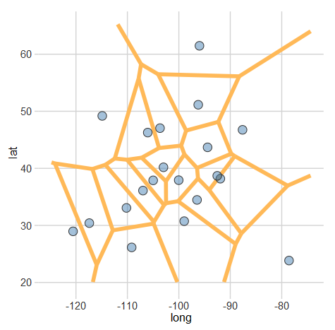
A Voronoi diagram (or tessellation) is neat way of visualizing spatial data. It essentially allows us to see the areas that are closest to a set of locations. For example, this map shows all of the Criagslist localities and the regions closest to each Craigslist locality. More formally, “A set of points (called seeds, sites, or generators) is specified beforehand and for each seed there will be a corresponding region consisting of all points closer to that seed than to any other.” (Wikipedia)

A handy library for plotting these in R is deldir. After installing that library (and ggplot2 if you don’t already have it), plotting a Voronoi diagram is simple.

#Let's generate some fake data
set.seed(105)
long<-rnorm(20,-98,15)
lat<-rnorm(20,39,10)
df <- data.frame(lat,long)

library(deldir)
library(ggplot2)

#This creates the voronoi line segments
voronoi <- deldir(df$long, df$lat)

#Now we can make a plot
ggplot(data=df, aes(x=long,y=lat)) +
  #Plot the voronoi lines
  geom_segment(
    aes(x = x1, y = y1, xend = x2, yend = y2),
    size = 2,
    data = voronoi$dirsgs,
    linetype = 1,
    color= "#FFB958") + 
  #Plot the points
  geom_point(
    fill=rgb(70,130,180,255,maxColorValue=255),
    pch=21,
    size = 4,
    color="#333333") +
  #(Optional) Specify a theme to use
  ltd_theme

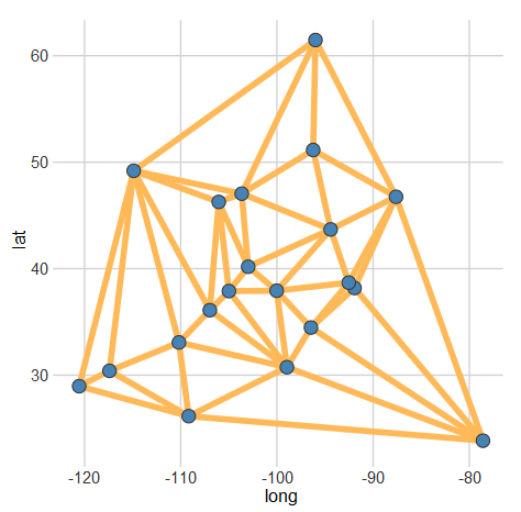
You should end up with something like this:A sample Voronoi diagram plotAdditionally, if you would prefer the Delaunay triangulation (which connects all of the sites), you just need to change voronoi$dirsgs to voronoi$delsgs in the line segment part of the plot. Here’s what that should look like:A sample Delaunay triangulation plotI have not found a fully automated solution to combine these plots with a map. However, using the ggmap library can get you pretty close.