PostgreSQL generate_series() Tricks

Before my current job, I actually had not heard of PostgreSQL. But it turns out to actually be a pretty prominent SQL server.

There are some weird quirks to Postgres and the management tools are pretty meh compared to SQL Server Management Studio, but there are a lot of neat features I keep bumping into. One such feature is the generate_series() function. Although a table with one column of consecutive integers sounds boring, there are a lot of interesting uses for having a “numbers table.” For example, when you run a SELECT sum(data) FROM table GROUP BY date query, you might have missing dates where the sum is zero. If you use your numbers table to add days to a start date, you can join that to your query to make sure no days are missed. However, Postgres makes a numbers table obsolete with the generate_series() function.

The syntax is simple and the result is what you would expect:

select generate_series(1,4);
 generate_series 
-----------------
               1
               2
               3
               4
(4 rows)

So here is the example from above where you want to view grouped data and you want to be sure you don’t miss any days without data. We’re also going to use generate_series() to make some simulated data!

with simul_data as(
	--Give me a random date betwen 8/1 and 8/7
	select (cast(trunc(random() * 7) as int)) + date '8/1/2013' as myDate
	--Give me a random number
	,cast(trunc(random() * 500 + 1) as int) as data
	--Make 10 rows
	from generate_series(1,10))
,full_dates as (
	--Select every date between 8/1 and 8/7
	select generate_series(0,6) + date '8/1/2013' as fulldate
)

--If we do a regular aggregate, here's what you get:
select mydate,coalesce(sum(data),0) as data_sum 
from simul_data 
group by mydate 
order by mydate;

  fulldate  | data_sum 
------------+------------
 2013-08-01 |        566
 2013-08-02 |        455
 2013-08-03 |        291
 2013-08-04 |        598
 2013-08-06 |        741
 2013-08-07 |        476
(6 rows)

--Notice the missing date? To force it in place, use a join.

select fulldate,coalesce(sum(data),0) as data_sum 
from full_dates 
	left join simul_data on full_dates.fulldate=simul_data.mydate 
group by fulldate 
order by fulldate;

  fulldate  | data_sum 
------------+------------
 2013-08-01 |        566
 2013-08-02 |        455
 2013-08-03 |        291
 2013-08-04 |        598
 2013-08-05 |          0
 2013-08-06 |        741
 2013-08-07 |        476
(7 rows)

I have one more example that is a bit esoteric, but I actually used it to generate a report the other day. One of our database tables has a unique two-digit identifier that consists of two letters. I wanted to see which of the 262 two-letter codes were still available. To do this, I used generate_series() and chr() to give me a list of letters. I then created a Cartesian product of the data which I could join with the live data.

with list as(
    --65 in ASCII is "A" and 90 is "Z"
    select chr(generate_series(65,90)) letter
)
select t1.letter||t2.letter combo 
from list t1
    --join every letter with every other letter 
    cross join (select * from list) t2;

 combo 
-------
 AA
 AB
 AC
 AD
 AE
[...]
 ZV
 ZW
 ZX
 ZY
 ZZ
(676 rows)

Know any other nice uses of generate_series() or Postgres in general? Share them in the comments!

Why I’m Learning: Python

Not having a technical degree, I’ve had to learn most of my analysis skills on my own. This fits well with my personality because I am the type of person who can be easily bored and always likes a new challenge. Because our field is so unique in that it is very multidisciplinary and covers a wide range of technologies, I think it is important for us to share our experiences with learning so that others can decide what to learn next. So that brings me to my current endeavor: Python.

I actually started learning with Learn Python the Hard Way and the Python app for iOS on a long road trip a fewmonths. Admittedly, not the most efficient way of getting started, but it was more interesting than rural Pennsylvania. Since then, I’ve been using it more often in practical applications to try and “think Python.” Here’s my list of reasons (so-far) why I feel Python is worth learning.

The New De Facto Academic Language

Within the past few years it seems there has been a shift from C/C++/Java in academia to Python. Especially in online free education, Python is almost exclusively used. Take a look at Udacity, MIT OpenCourseWare, and Coursera and you will find a multitude of classes that use Python. Learning Python will allow me to jump in to some of the higher level classes that assume a familiarity with the language.

Dem Data Structures

Need a list? x = ["Apple", "Orange", "Banana"]. Done. Dictionary? x = {"Apple":100, "Orange":101, "Banana":102}. Done. These are obviously supported in all main languages, but the simplicity of the structure is great. You don’t even have to import any of the libraries.

Open Source

I’m not an open source fanboy, but I definitely appreciate and respect the community. One of the greatest benefits of open source software is that it generally can be installed and used quickly on any computer. Python 2.7.3 for Windows 64-bit is only 15 MB and as a test, I just ran through an install and setup process in under five minutes. Of course, you also get all of the other benefits of open source software: access to source code, freedom to distribute, ability to roll your own modifications, etc.

Great for Scripting

You can do everything from adding numbers in the console to creating web applications with Python, but I’ve found it most useful for short scripts. If I need something relatively small, I can easy pop open a text editor, write a few dozen lines of code, and have a working program. Compare this to my other main language Java where it almost feels like a chore to create a script/task-automater. Python is a more abstract language than those in the C family and I find that to be very intuitive for putting together a script.

There are a lot of neat aspects to Python and every time I look something up on StackOverflow, I learn some new trick for writing more Pythonic code. I highly recommend it as a starting programming language or as a scripting language.

What factors determine if a university’s alumni will donate?

Last week, I caught a post on reddit from Vizual Statistix where data on university alumni giving rates was plotted. The graph was very polished and I saw there were a lot of factors plotted. The main correlation that better ranked universities have higher giving rates was obvious, but I wasn’t so sure about the other factors. I wanted to see what a predictive analysis would reveal so I asked for the data and was happy to be pointed in the right direction.

There are a lot of variables in this data set and I chose to use a random forest to help me decide which variables were relevant. A random forest model builds hundreds of decision trees and then selects the best tree from the “forest”. A nice feature of the randomForest package for R is that it provides a nice list of the variables and their importance in predicting the model.

The top five factors are as follows:

  1. Applicant acceptance rate (lower acceptance is better)
  2. U.S. News University Rank (better rank is better)
  3. Average need-based scholarships or grants for full-time undergraduates (more money is better)
  4. Six-year graduation rate (higher graduation is better)
  5. Freshman retention rate (higher retention is better)

Obviously many of these variables are related. In general, better schools are more selective, have more committed students, etc. In fact, this data confirms pretty well what we would suspect–alumni are more likely to give if they went to a good school.

In keeping with the vibe of the Vizual Statistix post, I chose to plot the giving rate with the US News Rank. However, in place of the religious affiliation and public/private ownership factors, I used color to show the acceptance rate. I also used short names of the universities in place of plot points. This is a technique I have loved since I first saw it in this post by Andrew Gelman. (Click to embiggen.)

Scatterplot of alumni giving rates compared to US News University Rank

Here is example code that you can run to generate this graph for yourself. I also included the random forest code. It really is that easy to build the model!

#Read in the data
unis<-read.csv(url("https://www.dropbox.com/s/1pi7crj6zmhhsl6/university_rankings.csv"))

#install.packagaes("randomForest")
library(randomForest)

#Create your model. Keep in mind any row with an NA will not be used in the model.
#For my model, I picked variables with lots of data
rfunis<-randomForest(AlumniGivingRate ~ USNewsRank+Control+Founded+Undergrads+Setting+StudentsPerFaculty+
                       ClassesFewer20Students+ClassesMore50Students+SixYearGradRate+InStateTuition+OutStateTuition+
                       RoomAndBoard+NeedBasedGrant+SelfHelpAid+NeedMetPercent+FinancialAid+NeedBasedScholarship+
                       NeedBasedLoan+Selectivity+Acceptance+Applicants+FreshmanRetention+
                       FraternityPercent+SororityPercent+OffCampusUndergrad,
                     data=unis, na.action=na.omit)

#Print the importance of each variable in the model, sorted
rfunis$importance[order(rfunis$importance,decreasing=T),]

#Make the plot
library(ggplot2)
png("scatterplot.png",width=600,height=600)
ggplot(unis,aes(x=USNewsRank,y=AlumniGivingRate*100,label=Sname))+
  geom_text(aes(color=Acceptance*100),size=4)+
  labs(x="US News University Rank (1=best)",y="Percent of Alumni Who Donate",
       title="Better ranked schools are more selective\nand have more alumni donors",
       color="Percent of Accepted Applicants")+
  theme(legend.position="bottom",
        plot.title = element_text(size = rel(2)))
dev.off()

Hair and Eye Color Correlations

Last week I gathered some data from RankMyPhoto, but I was disappointed to see that eye and hair color were free response questions instead of drop down questions.

However, I got a great suggestion from a reddit user to use OpenRefine to try and consolidate some of the similar data. I was really happy with the results and was able to get some good, clean factors. To make it more usable, I also took some liberties on simplifying some of the more descriptive colors into simpler categories. I then fed that data back into R to make correlation tables. The result of this is the following graphic.

Heatmap of eye and hair color combinations

My primary goal was to show the correlation through the actual colors. A heatmap does this well, but because the percentages are so low in general, it ended up looking too pale and washed out. The quantiles helped to make sure even the lower percentages were still visible. Finally, I determined the quantiles according to their relative rank in each row or column instead of overall. Thus, for example, even though red hair is the rarest, you can still see the red/green square pop which you wouldn’t in a true overall heatmap.

Predicting Attractiveness on RankMyPhoto

To be honest, RankMyPhoto is a pretty skeezy website. It encourages objectification and seems like a big cry for attention. The premise is you upload a photo of yourself and anonymous internet users can rank your attractiveness and also vote you “Hot” or “Not”. But they do have good data.

I built a python script to scrape about 9000 profiles for their biographical data. Unfortunately, height, weight, eye color, and hair color are all text inputs so there was far too much variation to do any analysis on them. But other factors such as age, education, alcohol/tobacco use, body type, etc. are consistent across profiles. I wanted to do two things with this data: first explore it to see if there are any interesting correlations and second, see if the data are significant to predict attractiveness.

Although they are not perfect, generalized linear models continue to be one of the most commonly used tools in statistics. R makes building these models very easy and my first step was to split out the data into training and test sets. I also had to remove some bad data.

rmpdef<-read.table("pdatatab.txt",header=T,sep="\t",allowEscapes=F,quote="",comment.char="")
rmp<-subset(rmpdef,rmpdef$Age<=60
            &rmpdef$Rating>0
            &rmpdef$MaritalStatus!="Widowed")
rmp<-rmp[rmp$Alcohol!="Often",]
filter<-as.logical(rbinom(nrow(rmp),1,.8))
rmptrain<-rmp[filter,]
rmptest<-rmp[!filter,]

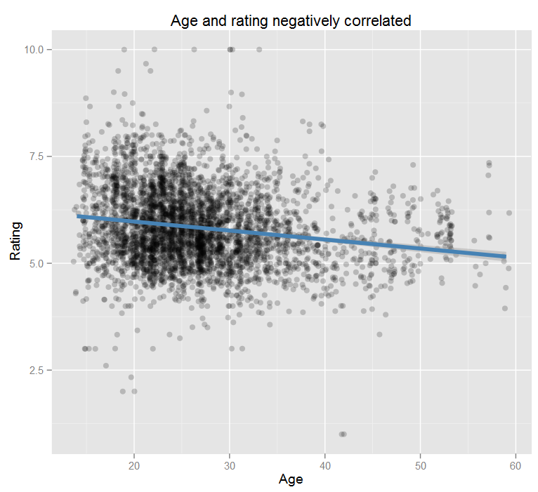
My first thought was to look at age and as expected, there is a strong correlation (p≈0).
Dot plot showing negative correlation between age and rating
But as is usually the case with real-world data, you can get a better correlation when looking at more variables. I built a few models and tested them using cross validation, looking for the one with the highest accuracy. My most successful model included age, alcohol usage, body type, religion, state, sexuality, marital status, and education and it predicted attractiveness within ±10% on the test data.

> lm_best<-lm(Rating ~ Age+Alcohol+BodyType+Religion+State+Sexuality+MaritalStatus+Education,data=rmptrain,na.action=na.omit)
> pred<-predict(lm_best,newdata=rmptest,na.action=na.pass)
> summary(abs((pred-rmptest$Rating)/rmptest$Rating),na.rm=T)
   Min. 1st Qu.  Median    Mean 3rd Qu.    Max.    NA's 
 0.0001  0.0370  0.0876  0.1181  0.1592  2.1420     844 

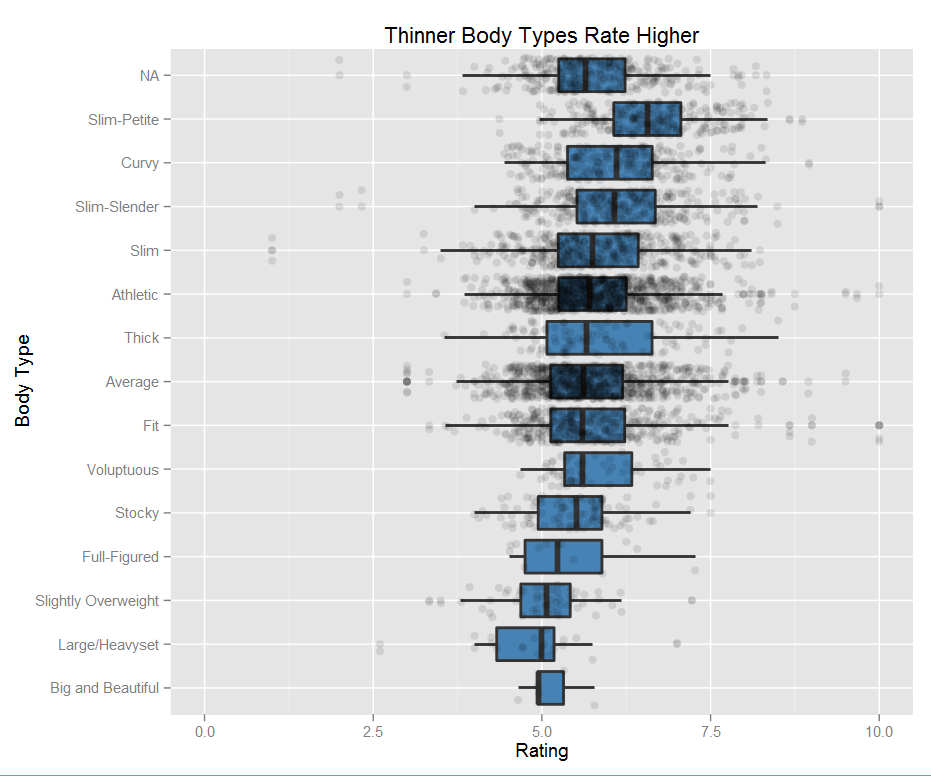
While I think it’s interesting that all of these data pieces correlate to rating, the one that I found most interesting was body type. Keeping in mind this data is all self-reported, the most common types were “average” and “athletic.” This graph shows the correlation between body type and rating with each point representing a person.

Box plots showing body type correlation with attractiveness rating

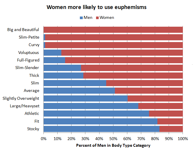
Some these body types are feminine in nature, so I also took a look at which types are more commonly used by men. I’m assuming that the voluptuous men are joking, but it is interesting to note that women prefer to use euphemisms for larger body types, whereas men use more direct terms.
Body type descriptors used by men and women

I built a quick app that lets you play around with all of the factors I gathered. It uses the values that I got from my model in R to predict the attractiveness. Note that all fields are required for the prediction to be accurate.

And just for fun:
Map showing average attractiveness by state