Review: Udacity Web Development (CS253)

When web applications started to become popular, a big selling point was that you could design one set of code and have it run on any internet-capable computer. Unfortunately the front-end of the internet is now so fragmented that this isn’t as true as it once was. Browsers support different feature sets (with IE in particular always significantly lagging behind), users can disable content such as JavaScript and Flash, and many users view the same content on screens of different sizes. Nonetheless, web applications seem to be continue to be the most popular choice for new applications.

Udacity’s Web Development course gives students a great introduction to the huge world of internet applications. Everything is taught in Python with a little bit of SQL and applications are built using Google’s App Engine. The primary project is developing a blog that support users and posts.

This was one of my favorite Udacity classes so far. The primary instructor is Steve Huffman (of Reddit and Hipmunk) and he does a great job of making engaging content. Web development is obviously his passion and he makes this clear in the videos. He also does a great job of relating course content to the real world. Almost every unit has an accompanying story or explanation of how the technology was used at Reddit. This makes it very easy to think about applying what you learned in your own application.

Udacity’s method of using short videos with quizzes works great for internet learning and this class is no different. Most pieces of knowledge are quickly tested and each unit ends in a larger project-based “homework” to add a new feature to the blog. My only complaint for this class is the grading utility for the homeworks. You get almost no feedback if something goes wrong while grading an assignment. This can be very frustrating to troubleshoot because of the potential number of fail points in the web application. It’s essentially tracking down an application failure with no stack trace.

Udacity suggests that students take their Intro to Programming class first (or have comparable knowledge), but I actually suggest some more practice with programming before tackling web development. There are enough new concepts in this course that you don’t want to still be struggling with basic programming concepts.

The next logical course (which doesn’t yet exist on Udacity) would be one that focuses more on the front-end. CSS is briefly touched on in this course, but nothing with JavaScript. Navigating the challenges of web UI would certainly make an interesting course that I’m looking forward to.

Predicting Performance at Ohio High Schools

The Ohio Department of Education recently released new statistics for school performance. The big news surrounding them was the inclusion of letter grades. However, overall letter grades will not go into effect until 2015. Until then, there are still some other overall performance indicators that can be used to evaluate schools.

The Performance Index (PI) is a score computed from standardized test scores. Essentially the higher students perform, the more points the school earns. These are then weighted based on enrollment so that schools are compared on an equal level. Although the PI is computed from test scores, it only looks at each student’s overall performance, not the performance at the subject level. I was curious to see which tests best correlate with PI and also which test scores correlate with each other.

To visualize this, I like to do a quick plot sketch plotting the correlations.
Correlation plotAnd…I couldn’t stop seeing this:
sperm

(Source: Wikimedia, licensed under Creative Commons.)

So because of how uninteresting the sketch was, I made a table of the Pearson correlations.

Perf. Index

Reading

Math

Writing

Soc. Studies

Science
Perf. Index

1.00

0.94

0.96

0.92

0.97

0.98
Reading

0.94

1.00

0.92

0.89

0.90

0.93
Math

0.96

0.92

1.00

0.88

0.93

0.95
Writing

0.92

0.89

0.88

1.00

0.89

0.88
Soc. Studies

0.97

0.90

0.93

0.89

1.00

0.95
Science

0.98

0.93

0.95

0.88

0.95

1.00

It is interesting that science and social studies correlate the most with the performance index, when math and reading scores are the only ones that count towards the “Progress” goal [PDF]. My armchair guess here is that schools who perform well have more time to focus on social studies and science whereas schools that perform worse must focus more time on math and reading.

Of course there are other factors that can describe a school’s performance. I wanted to see which of those are good predictors of the PI.

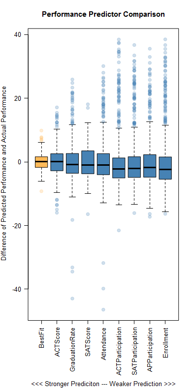
Unsurprisingly, a linear model combining several variables was very good at predicting the PI. Specifically, a model combining average ACT score, graduation rate, average SAT score, attendance, ACT participation, SAT participation, Advanced Placement participation, and enrollment was accurate within ±1.95 points on average. But, I thought it was interesting how successful some of the individual variables were at predicting performance. This chart shows each individual variable’s success compared to the best fit model:
Box plots of performance variables
This is a good example of correlation and not causation. It is unlikely that any of these factors cause success. Rather, there are likely underlying issues that cause high performance across the board. While school performance data is important for communities to see, I believe that the Department of Education should also consider including some of those potentially causal data points on their reports. Knowledge about what makes good schools good and bad schools bad is critical if we hope to improve education.

Getting GPS Data from Android

Because Android’s source code is open, there are a lot of goodies that anyone with an Android device and Google’s development kit can explore. I was digging through the API section regarding location services when I found the method getSatellites(). How can you resist a method that sounds that cool?

Before you can get the GPS data, you need to set a couple of permissions in the manifest:

 <uses-permission android:name="android.permission.ACCESS_FINE_LOCATION"></uses-permission>
	<uses-permission android:name="android.permission.ACCESS_COARSE_LOCATION"></uses-permission>

Next you can start building the Activity. You don’t really need to do anything in the UI since we’re only using the Android device for its GPS antenna.

Here’s the code I used to get my data:

package com.letstalkdata.gps_fun;

import java.util.Random;

import android.location.GpsSatellite;
import android.location.GpsStatus;
import android.location.Location;
import android.location.LocationListener;
import android.location.LocationManager;
import android.os.Bundle;
import android.app.Activity;
import android.content.Context;
import android.util.Log;
import android.view.Menu;

public class MainActivity extends Activity implements LocationListener {
	
	private LocationManager locationManager;
	private LocationListener locationListener = new DummyLocationListener();
	private GpsListener gpsListener = new GpsListener();
	private Location location;
	private GpsStatus gpsStatus;

	@Override
	protected void onCreate(Bundle savedInstanceState) {
		super.onCreate(savedInstanceState);
		setContentView(R.layout.activity_main);
		locationManager = (LocationManager) getSystemService(Context.LOCATION_SERVICE);
		gpsStatus = locationManager.getGpsStatus(null);
		locationManager.addGpsStatusListener(gpsListener);
		locationManager.requestLocationUpdates(LocationManager.GPS_PROVIDER, 2*1000, 0, locationListener);
	}

	@Override
	public boolean onCreateOptionsMenu(Menu menu) {
		getMenuInflater().inflate(R.menu.main, menu);
		return true;
	}
	
	private void getSatData(){
		Iterable<GpsSatellite> sats = gpsStatus.getSatellites();
		
		for(GpsSatellite sat : sats){
			StringBuilder sb = new StringBuilder();
			sb.append(sat.getPrn());
			sb.append("\t");
			sb.append(sat.getElevation());
			sb.append("\t");
			sb.append(sat.getAzimuth());
			sb.append("\t");
			sb.append(sat.getSnr());
			
			try {
				new HttpLog().execute(sb.toString());
			} catch (Exception e) {
				Log.w("SatData Error",e.getMessage());
			}
		}
		
		gpsStatus = locationManager.getGpsStatus(gpsStatus);
	}

	protected void onResume() {
	   super.onResume();
	}
  
	@Override
	public void onLocationChanged(Location location){ }
	@Override
	public void onProviderDisabled(String provider) { }
	@Override
	public void onProviderEnabled(String provider) { }
	@Override
	public void onStatusChanged(String provider, int status, Bundle extras) { }
	
	class GpsListener implements GpsStatus.Listener{
	    @Override
	    public void onGpsStatusChanged(int event) {
	    	getSatData();
	    }
	}
	
	class DummyLocationListener implements LocationListener {
		//Empty class just to ease instatiation
	    @Override
	    public void onLocationChanged(Location location) { }
	    @Override
	    public void onProviderDisabled(String provider) { }
	    @Override
	    public void onProviderEnabled(String provider) { }
	    @Override
	    public void onStatusChanged(String provider, int status, Bundle extras) { }
	}
	
}

These are the real “goodie” methods in the code above:

  • getAzimuth() : Returns the azimuth of the satellite in degrees.
  • getElevation() : Returns the elevation of the satellite in degrees.
  • getPrn() : Returns the PRN (pseudo-random number) for the satellite.
  • getSnr() : Returns the signal to noise ratio for the satellite.

One quirk I noticed is that the internal GPS service does not actually refresh until it detects you are at a new location. So while it will continue to spit out numbers, you won’t see anything change until you move the device.

The azimuth and elevation tell you where, approximately, the satellite is in the sky from your point of view. To make sense of this, stand facing north and turn towards east the number of degrees of the azimuth. Then tilt your head upwards the number of degrees of the elevation. For example, when I grabbed this data, the satellite with PRN 18 had an Azimuth of 324°, which is almost a complete circle East, or about a tenth of a turn West. The elevation was 67° up from the horizon, which is about three quarters of the way from looking straight ahead to looking straight up.Example of using azimuth and elevation(Source: NOAA, Public Domain)

And if you want to know which specific satellite you’re looking at, Wikipedia has a list of the GPS Satellites with their PRN assignments.

Why the one statistical test you probably know is the wrong test to use

Maybe it was Stats 101 or a psych class or a business class, but if you had to learn about any statistical testing in school, you probably learned about the Student’s t-test, or just “t-test” for short.

The test sounds very useful. Suppose I have a set of data set of observations that come from two different populations. I then calculate the average for each of those populations and I notice the average of one population is higher than the other. The t-test will tell me how likely I am to have gotten the observations given that the two populations are not different. In other words: do I have a statistically meaningful result?

When you learned about this test, you probably took a small data set of numbers, ran through the arithmetic, looked up some numbers in a table and concluded that the populations either are different or the same. The test is so pervasive, it’s even built into Excel with the TTEST function. Unfortunately there are several (often-forgotten) assumptions of t-test that often make it the wrong test to use!

Are real name YouTube commenters less profane?

YouTube recently started rolling out Google+ integration for users to use their real names on the site. This is one of many changes they are working on to improve to awful quality of YouTube comments. I hypothesized that real name users are less likely to use profanity.

To test this, I used the YouTube API to gather about 7500 comments and information about the comments’ authors to determine if they are real name or username users. (Check out my post on web scraping with BeautifulSoup for more details.) Finally, I counted uses of about 30 profane words and variations in the comments.

My data showed that real name commenters use a profanity for every 1 out of 60 words and username commenters use a profanity for every 1 out of 54 words. (Side note: The most profane comment with a whopping 1:3 profanity rate was by real name user Elijah Morrison: “Okay? let me get this FUCKING STAIT, the thing that i have been waiting for this whole time is some fucking bullshit i dont even understand? WHAT THE FLYING FUCK I THOUGHT THEY WERE GONNA REVEAL THEY WERE TRYING TO MIND CONTROL US OR SOME SHIT! FUCKING FUCK FUCK FUCKING BULLSHIT FUCKIN WAIST OF TIME ASS FUCKK FUCKIN FUCK!!!”)

When I run a t-test on the data, I am given a p-value of 0.2924 which means there is a 29% chance I would have gotten these results if there is no difference between real name and username commenters’ profanity rates. But a t-test is the wrong test to use because my data does not meet the assumptions of the t-test!

The t-test makes six assumptions, but I want to focus on the normality assumption. For the t-test to work, your data should be pretty close to normally distributed, i.e. in a bell curve. The YouTube comment data is not normal. Thankfully, there are statistical tests that do not assume a normal distribution known as “non-parametric” tests. The non-parametric counterpart of the t-test is the Mann-Whitney U test. Because my data meets the assumptions of the Mann-Whitney test, I can use it. The result is a p-value of 0.0015 which means there is a 0.1% chance that I would have gotten these results if there were no difference between username and real name commenters.

When to use the Mann-Whitney test

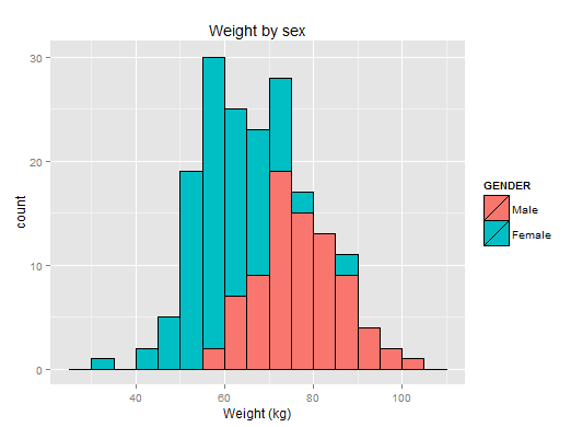
Here’s a very manageable dataset showing some physical data of students before and after a health class. This is a distribution of weight by sex:
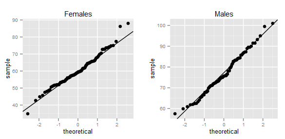
Histogram comparing weight and sexWe can definitely see a difference between males and females. Furthermore, the data looks normally distributed. A qqplot can confirm this:
qqplot of weight by gender

Since our data meets the assumptions of both the t-test and Mann-Whitney, we have to decide which to use. Or do we? Take a look at the results:

#Mann-Whitney is also called Mann-Whitney-Wilcox
#hence wilcox.test

> wilcox.test(BAWPOS ~ GENDER,data=weight)

	Wilcoxon rank sum test with continuity correction

data:  BAWPOS by GENDER 
W = 7335, p-value < 2.2e-16
alternative hypothesis: true location shift is not equal to 0 

> t.test(BAWPOS ~ GENDER,data=weight)

	Welch Two Sample t-test

data:  BAWPOS by GENDER 
t = 12.1331, df = 164.236, p-value < 2.2e-16
alternative hypothesis: true difference in means is not equal to 0 
95 percent confidence interval:
 13.87739 19.27207 
sample estimates:
  mean in group Male mean in group Female 
            76.76173             60.18700 

As it turns out the Mann-Whitney test’s power efficiency is about 95% for moderately-sized data sets. This makes your life easy! In almost all cases, you will be fine using the Mann-Whitney test.

So you can see that while the t-test is appropriate in some situations, it’s requirement of normality is so critical that there are many times it will not work correctly. Always check the assumptions and when in doubt you’re less likely to fail with a non-parametric test!

A Social Network of Downton Abbey

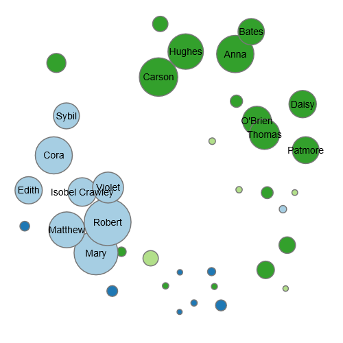
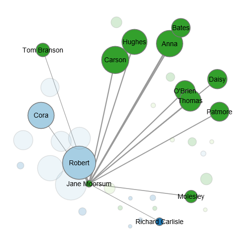
Some of my favorite television shows are those with ensemble casts. I feel that a large cast keeps the episodes fresh and makes it hard to tire of a particular character since every character is just a small piece of the larger television show universe. One of the more popular ensemble cast shows on right now is Downton Abbey. I really wanted to see how the characters fit together graphically, so I made this social network graph using Python and D3.

(Click here for a larger version)

The data I used was the (unofficial) episode transcripts available here. I used Python to parse each script and count a few pieces of data. The most important is how many times character X is also in a scene with character Y. I excluded characters who appeared in fewer than ten scenes. Next I used Python to generate the JSON data that is fed into this visualization.

Although it took a lot of tweaking to get the details right, the graph instantly showed some interesting character relationships.
Downton Abbey Social Network

To me the most interesting are the character pairs of the series. Matthew and Mary, O’Brien and Thomas, and Carson and Hughes are each closely linked. However, there are a few important “conceptual” relationships that aren’t actually present in terms of on-screen presence. Notice that Robert and Cora aren’t actually that close nor are Bates and his wife Vera. In both cases it is because Cora and Vera share their on-screen presence relatively evenly with other characters.

The graph also shows the relative bundling of the Upstairs and Downstairs.

An example of network overlap in Downton Abbey

A few interesting outliers are Tom Branson who is linked with Sybil and Jane Moorsum, the maid who becomes romantically involved with Robert. Carson, of course, is in the middle of it all and is the closest to the family of all the staff. In contrast, Daisy and Bates are pushed the farthest from the family. This might seem odd for Bates, but I believe it is because his only close relationship to the family is Robert–he has very little screen time with other Granthams. One other interesting character is Moseley who is not tied to any particular group but instead has loose links with almost everyone.

Note that the D3 algorithm for generating the graph only uses shared screen time as a guide for building the graph. Your specific view will be different from these images, but the same general themes should be present. Finally, my code made use of these two D3 examples: Chicago Lobbyists by Christopher Manning and Les Mis Force Directed Graph by Mike Bostock.