I recently attended a talk by the co-author of this paper, Dr. James Collins. He shared a figure from this paper in his presentation that showed American black mothers give birth to lower weight babies than both American white mothers…
Review: Coursera Machine Learning
Although not as much of a buzzword as “Big Data”, “Machine Learning” is definitely en vogue. To be honest, the phrase sounds much more exotic than the actual technique! Nonetheless, the area of artificial intelligence interests me so I decided…
Programming language similarity
Programming languages are often described in terms of paradigms or features. This naturally leads to families of closely-related languages. By using a clustering algorithm, we can visualize how closely any two languages are related. This dendrogram places languages in a…
Which Cancer Centers are Closest to You?
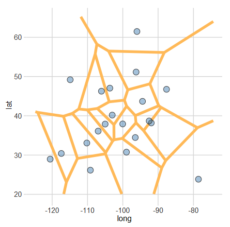
Last week I described how Voronoi diagrams can be created in R. Using that technique (and some heavy post-processing in Photoshop), I created this Voronoi diagram of the NCI-designated Cancer Centers in the U.S. According to the website, these centers…
Creating Voronoi Diagrams with ggplot

A Voronoi diagram (or tessellation) is neat way of visualizing spatial data. It essentially allows us to see the areas that are closest to a set of locations. For example, this map shows all of the Criagslist localities and the…
