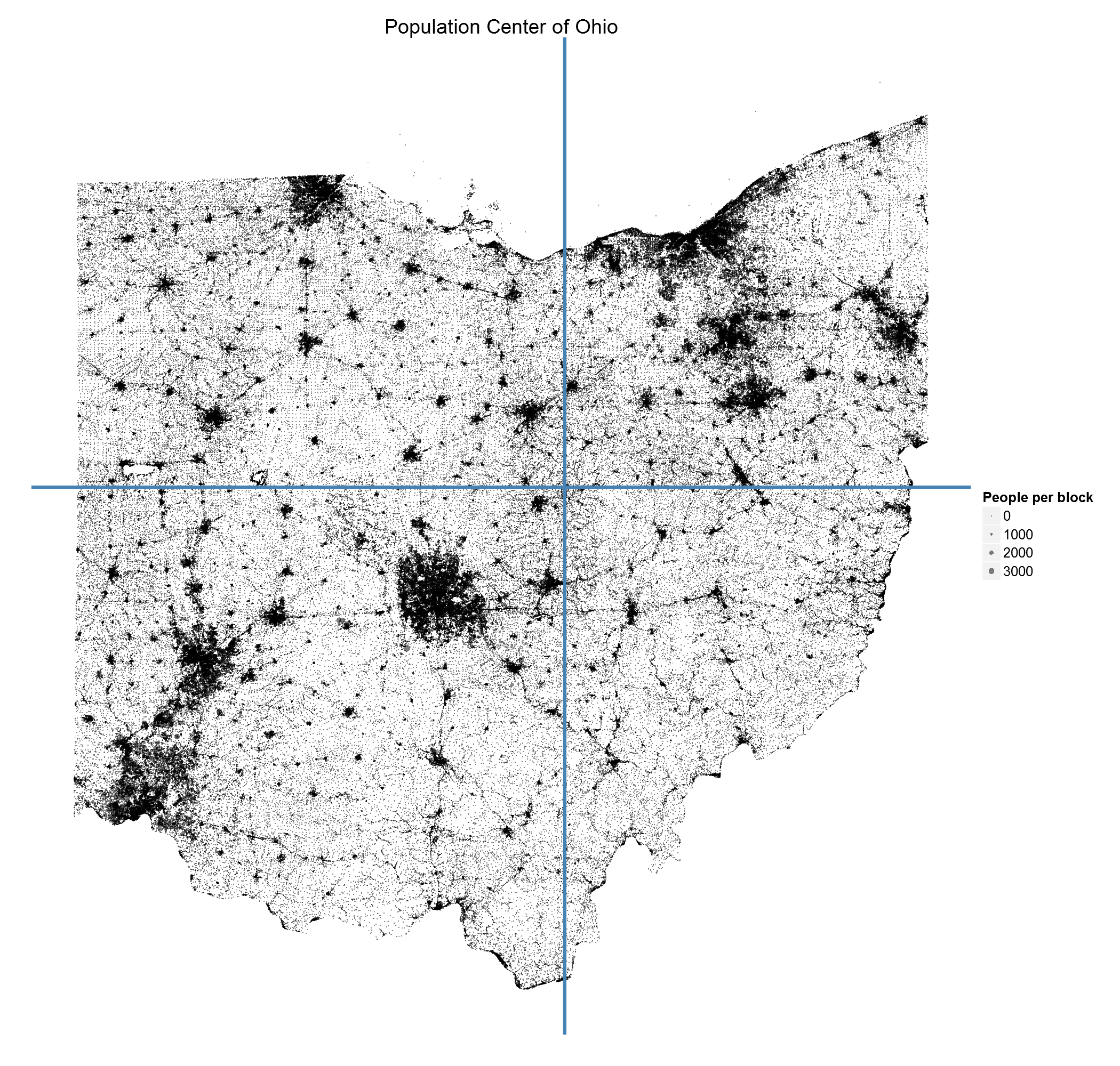
Population Center of Ohio
Click to enlarge
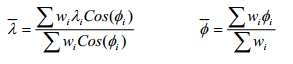
There are a few different ways of determining a population’s center, but the method I used for this graph is the one currently used by the Census [PDF]. If every person were the same weight, where would the balancing point be? Mathematically, it’s the average latitude (λ) and longitude (Φ) of every person’s position (with a correcting factor for the convergence of longitude.)
I found Brandon Martin-Anderson’s details about his census dot-map very helpful, although I used my own method to process the data since I didn’t need his level of detail. The Census provides shapefiles at their FTP here that describe each Census block (their smallest geographic unit). You can download them all or pick a specific state by looking up its FIPS code. Next, I processed the shapefile in Python using the shapefile library. This script loads each census block (a shape within the file), finds its average latitude and longitude, and extracts the number of people in that particular block. Finally all the data is printed into a text file for final processing in R.
import shapefile

def main():
    sf = shapefile.Reader("D:\\oh_shape")
    shapes = sf.shapes()
    records = sf.records()
    rows = []

    for i in range(len(shapes)):
        id = records[i][4]
        location = get_average_lat_lon(shapes[i].points)
        num = records[i][7]
        rows.append(Row(id,location,num))

    f = open("..\\data\\data.txt","w")
    f.write("id\tx\ty\tnum\n")
    for r in rows:
        f.write("{}\t{}\t{}\t{}\n".format(r.id,r.location[0],r.location[1],r.num))
    f.close()

def get_average_lat_lon(points):
    x = []
    y = []
    for p in points:
        x.append(float(p[0])) #The longitude component
        y.append(float(p[1])) #The latitude component
    return sum(x)/float(len(x)),sum(y)/float(len(y))

class Row:
    def __init__(self, id, location, num):
        self.id = id
        self.location = location
        self.num = num

if __name__=="__main__":
    main()
The R script is even shorter, basically a line to read the data, a line to calculate the averages, and then the ggplot output.
oh<-read.table("data.txt",header=T,sep="\t")
ohCenter <- c(sum(oh$num * oh$x *cos(oh$y))/sum(oh$num * cos(oh$y)),
              sum(oh$num * oh$y)/sum(oh$num))

library(ggplot2)
png(filename="..\\images\\ohio_population_center.png",
    width=2100,height=2000,units="px",pointsize=24,type="cairo")

ggplot(oh,aes(x=x,y=y))+
    geom_point(aes(size=num),alpha=0.50)+
    geom_hline(y=ohCenter[2], color="steelblue", size=3)+
    geom_vline(x=ohCenter[1], color="steelblue", size=3)+
    #coord_fixed()+
    theme(panel.background = element_rect(fill="white",color="white"),
          text = element_text(size=32),
          axis.text = element_blank(),
          axis.ticks = element_blank(),
          panel.grid = element_blank())+
    scale_size_continuous(name="People per block")+
    labs(x="",y="",title="Population Center of Ohio")

dev.off()
This map really shows the sprawl of the three largest cities in Ohio and solidifies the concept of “metro area”. When you look at the large version of the map, you can also notice some interesting oddities. For example, to the southwest of Columbus there is a large dot seemingly in the middle of nowhere. I first thought this was an error, but when I plugged the coordinates into Google Maps, I found the Orient prison. What other inferences can you draw about population from this map?