Predicting Performance at Ohio High Schools
The Ohio Department of Education recently released new statistics for school performance. The big news surrounding them was the inclusion of letter grades. However, overall letter grades will not go into effect until 2015. Until then, there are still some other overall performance indicators that can be used to evaluate schools. The Performance Index (PI) is a score computed from standardized test scores. Essentially the higher students perform, the more points the school earns. These are then weighted based on enrollment so that schools are compared on an equal level. Although the PI is computed from test scores, it only looks at each student’s overall performance, not the performance at the subject level. I was curious to see which tests best correlate with PI and also which test scores correlate with each other. To visualize this, I like to do a quick plot sketch plotting the correlations.
And…I couldn’t stop seeing this:
So because of how uninteresting the sketch was, I made a table of the Pearson correlations.
| Perf. Index | Reading | Math | Writing | Soc. Studies | Science | |
|---|---|---|---|---|---|---|
| Perf. Index | 1.00 | 0.94 | 0.96 | 0.92 | 0.97 | 0.98 |
| Reading | 0.94 | 1.00 | 0.92 | 0.89 | 0.90 | 0.93 |
| Math | 0.96 | 0.92 | 1.00 | 0.88 | 0.93 | 0.95 |
| Writing | 0.92 | 0.89 | 0.88 | 1.00 | 0.89 | 0.88 |
| Soc. Studies | 0.97 | 0.90 | 0.93 | 0.89 | 1.00 | 0.95 |
| Science | 0.98 | 0.93 | 0.95 | 0.88 | 0.95 | 1.00 |
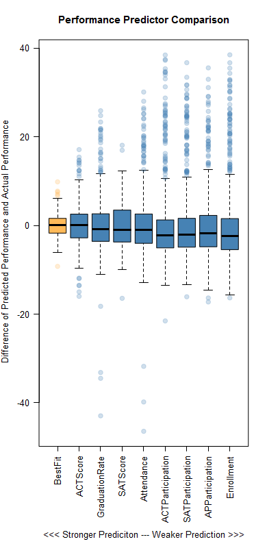
It is interesting that science and social studies correlate the most with the performance index, when math and reading scores are the only ones that count towards the “Progress” goal [PDF]. My armchair guess here is that schools who perform well have more time to focus on social studies and science whereas schools that perform worse must focus more time on math and reading. Of course there are other factors that can describe a school’s performance. I wanted to see which of those are good predictors of the PI. Unsurprisingly, a linear model combining several variables was very good at predicting the PI. Specifically, a model combining average ACT score, graduation rate, average SAT score, attendance, ACT participation, SAT participation, Advanced Placement participation, and enrollment was accurate within ±1.95 points on average. But, I thought it was interesting how successful some of the individual variables were at predicting performance. This chart shows each individual variable’s success compared to the best fit model:
This is a good example of correlation and not causation. It is unlikely that any of these factors cause success. Rather, there are likely underlying issues that cause high performance across the board. While school performance data is important for communities to see, I believe that the Department of Education should also consider including some of those potentially causal data points on their reports. Knowledge about what makes good schools good and bad schools bad is critical if we hope to improve education.


