Chart Gimmicks: Spinning Charts
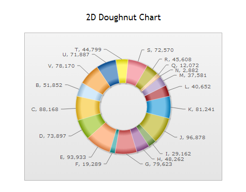
FusionCharts is a product that makes designing graphs and charts for the web simpler. It has some nice benefits: the charts can be Flash or JavaScript, they have a nice polished look, and they are very customizeable. Unfortunately, they make it very easy for designers to make bad graph choices. I’m not going to rail on pie graphs since it has been done before [PDF]. Pie charts are a bit of a phenomenon in that they are really enticing to people, but ultimately aren’t very useful. But for some reason, FusionCharts goes one step further and adds a gimmick: their pie charts spin.
 (OK, I know I said I wasn’t going to rail on pie charts, but this one isn’t even sorted! And I feel like they are admitting its useless by including all the data points.)
To see it in action, click here and take a look at their demos. Just click, drag and watch it go! How can you resist putting this in your next dashboard? Nothing on their web site addresses this specifically, but my guess is that they chose to add this feature because interactive graphs are a big selling point of the suite. Now I’m all for interactive visualizations when they enhance the user experience, but I don’t see what spinning adds. It does not make the chart easier to read or highlight information, it’s just a gimmick. As visualization designers, its our job to make data interesting and intriguing Unfortunately, that often means steering clear of the default settings and wading through the gimmicks in software.